- Read Tutorial
- Watch Guide Video
So to get started I have the completed app open and basically what you see here is we have three different kind of areas. We have (1)the logo, (2)the search, and (3)the recent posts.

Now inspecting this you can see on my screen that I have this main class this main div of home.
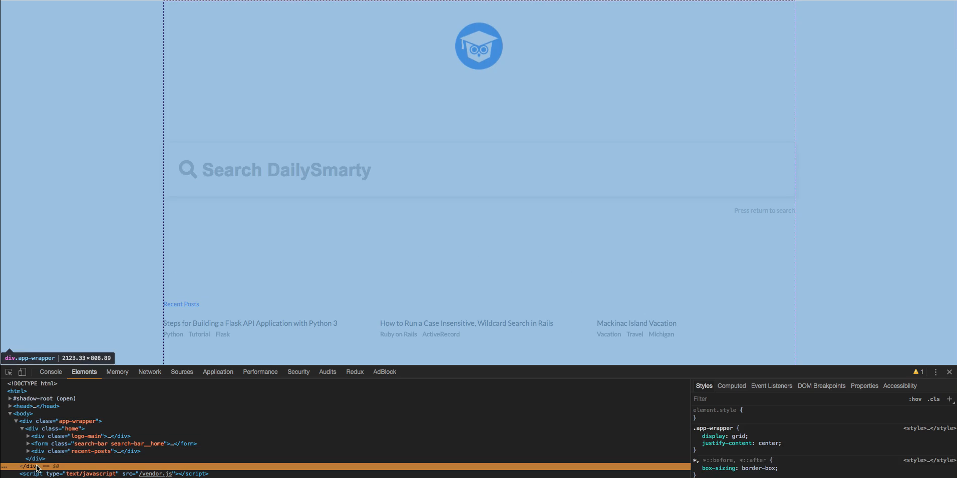
Now within here we have three divs and that is just that the logo, the search, and the recents. You might also be able to see these dotted lines everywhere and that's where CSS grid comes in. Within each one of these divs we have a grid of their own. So on this logo we have a grid that is aligning that in the center. If I uncomment or if I unselect grid or if I comment it out, if I cross it out you can see that it quickly goes to the left there because there is no grid applied to it.

Now if I do the same for these two other div's the same thing happens. Now in recent posts I'll also do that and you won't be able to follow along here since you don't have this completed app. Basically I just uncommented all the grid styles and we're left with some basic styles. We have some styles on these components obviously but the grid isn't there none of it is laid out properly.

So what we need to do is learn how we can apply the styles in a code pen so we can apply them in our app when we get started in the next guide.
So I'll head over to the Codepen here and you'll see that I have all these divs I recommend copying these pretty simple stuff. It's just a div with a class of container, a div with a class of search, and a div with a class of recent with an unordered list within it.
codepen
<div class="logo">
  logo goes here
</div>

<div class="search">
  <input placeholder="daily smarty">
</div>

<div class="recent">
  <ul>
    <li>post</li>
    <li>post</li>
    <li>post</li>
  </ul>
</div>
Okay, so I have no styles applied yet I have them all commented out but we will slowly uncomment them and explain them. Now down here you see we have our logo, we have our search, and we have our posts. Now if we add grid to this nothing will happen and that's because the height of our document is still only as tall as what's in here so it's about down to here just below the last post. And I can show you what that means by adding in this background color of sky-blue, you can see quickly that it's only as tall as the content.

So something we can do to change that is by giving it a height of like 350 pixels perhaps and you can see that quickly we have kind of this grid layout.

If I uncomment grid you'll notice it goes all the way back up to the top.

So I'm just going to leave that in because we want that. Now we don't really want this to touch the top and we want this to be about the same distance from the bottom as it is from the top. Kind of like you see here we want there to be in space on the top and at the bottom.
So in our pen here, if I uncomment lets see which one will it be, align content but let's go to this CSS grid document. If you google CSS grid it should be right here the first one.

It may be a couple down for you but it's a complete guide to grid using CSS tricks. Now in here this is how I learned it, it's a really good explanation of the grid. Now the way I learn things using resources like this just so you know how to approach things like this, isn't by just reading it word for word. It's honestly just by messing around with things and referencing certain things that I think I might need and eventually it all fits.
So what we want to look at is align content. So I'm just going to hit command F and search align content in the top right here.

And it says okay sometimes the total size of your grid might be less than the size of its grid container. Okay so let's just think about that, sometimes the total size of your grid might be less than the size of its grid container. This could happen if all the items are size with non-flexible units like pixels. In this case you can set the alignment of the grid within the grid container. This property aligns the grid along the block(column) axis (as opposed to justify content which aligns the grid along the inline(row) axis). I'm just going to scroll down and we did align-content: space-around;.
So we're getting this which is the exact effect we want.

In the design it should look very similar. So align content, we have a first box here a second box and our third. Exactly like we have here in grid container for align content space around. So let's go ahead and go to our codepen here and it looks like we put space between let's put space around. Space between just put space between nothing on top, we want to put space around. Okay that looks great, it looks exactly like our design.
Well not exactly but you know what I'm saying. So back in our pen here, let's go ahead and when we were reading about line content it said something about justify content. And we want to use justify items because we want to center the items within their own containers. So justify items says "Aligns grid items along the inline(row) axis (as opposed to align-items which aligns along the block(column) axis). This value applies to all grid items inside the container."
So basically if it has a line it's going to be the column and if it has justify it's going to be broke. Now let's go down here and it looks like what we want is justify-items: center;. So let's see, do we actually want this? Probably not because we don't have any rows here but we might want to do that for the stuff that's within.
Let's go to our codepen and see what we can do. Let's first try align items and put center and it does nothing. Let's justify items. Yes. So again it's the columns.

So basically we only have one column so that's going to put it right in the middle of this. If we had two columns them it would put it somewhere around the 1/3 of the page mark. We could try that out, what we would have to do is cut this logo div out completely using command X and put in two divs and pasted within each of those divs.
Let's see if that works. OK, so it looks like it's going on the top and bottom here.

Okay, that makes sense. Its because we're applying it to the container. If we say class is equal to sub and right here do the same. Now it certainly went well, let's head back to something that looks like our app a bit (Max reverts all the changes he just made). So we have our logos, we have our content, let's go ahead and just do that. So basically we want to use justify-items so it aligns in the center column here since we only have one column.
Heading back to css-tricks there's like three columns but we want it to be in the center so we put center. If we put stretch I'd imagine it would stretch the content across the entire thing. I don't know how about that would work with a list but let's try it out let's put stretch. OK, so what I'm imagining happening is it's stretching the entire item so the input is really this wide or the the div is but the input is not.
So if we cut this out it would go all the way across because basically we're saying stretch and it's stretching input to be worth the entire center.

Now if we put center again I'd imagine it would center it and yeah it does. I was a little iffy on the width but I guess there's a default width for input. So that's how that works and even though this has nothing, like we're kind of going off topic like what we want to actually get the effect. The reason even though we're doing that it's really good at doing that because we kind of learn how these different items work.
So I recommend doing that when building things, don't just try and get a complete objective. Try and mess around with the different available items and really just learn how these things work. Just really mess around as quick as you can really and you'll pick it up quicker.
OK so align item center we don't want that and we have our content centered. If you look in our app here it's kind of the same effect. So that's all we really need to do for this example. But in later guides we might come back here and learn more about how we can get these other effects.
So I'll go ahead and let's go and hop into the next guide where we will actually start our next component and then we will start off with the logo component where we will learn how to build this logo. So I'll catch the next guide