- Read Tutorial
- Watch Guide Video
So what we're going to want to do is close out every single file and open up our bootstrap.js and in here we need to provide a couple of imports so we can actually navigate through our application. So what we want to do is go into import BrowserRouter from react-router-dom and let's change this to router, and then let's import switch and that should be good.
bootstrap.js
import {Router, Switch } from 'react-router-dom';
Let's change BrowserRouter to Router and then has history as a prop to history.
bootstrap.js
<Router history={history}>
    <Layout>

    </Layout>
</Router>
All right, we're going to have to import this, so let's go under our CSS and say import history from './history';.
bootstrap.js
import './style/main.scss';

import history from './history';

import Layout from './components/layout';
We're going to have to actually create this file so a little bit more set up. Let's go and go to our source directory and say new file history.js and let's import { createBrowserHistory} from 'history'; and then let's export it, export the default create browser history and call it like a function and pass in two bracket's.
history.js
import { createBrowserHistory} from 'history';

export default createBrowserHistory({});
That will give us a history object that we can work with throughout our application and import as needed. All right, we've imported into our bootstrap, we've provided it into our router and now when we import this into different files we know it's part of our router, so it's going to push us to routes that we have in here okay.
So within our layout let's create another component or let's utilize another component that we've imported which is called Switch. So lets say switch and now what we want to do is provide routes so say route and that's another thing we need to import from react-router-dom is route.
Now we can provide routes and we just need to give it a path so our default one is going to be slash obviously for home and we're going to say exact, then we're going to say component is equal to and this is where we're going to put our signin components.
<Route path='/' exact component={<h1>asdf</h1>}>
Right now I'll just put, well let's see, it's going to want a component class so this probably won't work like this because that straight JSX. Let's go check the browser and see if it worked, I don't think it will. Let's hit inspect, and you'll see we are getting a lot of errors for some reason.

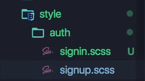
Okay so let's get rid of this h1 and let's create our signin component. OK so now we're set-up, now we're going to start building out our core features. Okay so let's go into components directory and say new folder and then say auth, and in here we just want to create a new file and let's call signin.js and let's create another file and let's call signup.js.

Now these files are going to be basic. So just type out our basic react import React and component all right class SignIn extends Component, render, return type out a div here, and will give a class name of sign-in. Okay so really basic stuff, let me just type out this expert real quick, export default SignIn.
signin.js
import React, { Component } from 'react';

class SignIn extends Component {
    render() {
        return {
            <div className='sign-in'>

            </div>
        }
    }
}

export default SignIn;
So I've typed out a basic component you should have the hang of this by now, like I've said a million times I need to stop saying that, okay so there we are. Let's copy that and throw it into signup.js and obviously we want to change this into an up on all of these, so SignIn to SignUp. Now let's just type out some text in one of these, let's say sign uppp and then in signin will say sign innn in that div.
signup.js
import React, { Component } from 'react';

class SignUp extends Component {
    render() {
        return {
            <div className='sign-up'>
                sign uppp
            </div>
        }
    }
}

export default SignIn;
signin.js
import React, { Component } from 'react';

class SignIn extends Component {
    render() {
        return {
            <div className='sign-in'>
                sign innn
            </div>
        }
    }
}

export default SignIn;
So that's setup. All I've done in these files is what you see here. Just basic components that say sign up and sign in. Okay let's go ahead and let's go into our bootstrap.js and let's import these under our Layout, let's say import SignIn from ./component/auth/signin. OK let's copy that import and let's call this one signup, now lets say sign in and we'll leave sign up for now.

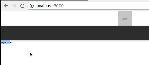
Let's just verify that signing is working on this route, all right you'll see that it says Sign in.

Now we have a problem and that's that it's appearing above our header and that's not really what we want. So what we need to do is define where this belongs on the grid. Okay so let's go ahead and go into our style and let's create a new folder and let's call it auth in this folder let's obviously provide signin.scss and signup.scss.
Now what we want to do is just say .signin and then we'll say, we're going to import a mixin in here because a lot of files, a lot of these components, are going to be placed they're actually all going to be placed in the same place. So what we want to do is we want to first go to our layout.scss and let's reference our thing here. We have header and then we have nav, and by the way I want to change this nav to just navbar.
layout.scss
.layout {
    display: grid;
    grid-template-rows: [header-s] 50px [header-e navbar-s] 50px [navbar-e content-s] 1fr [content-e];
    grid-template-columns: [s] 1fr [e];
}
Okay so I just changed this to navbar and then I'm going to go into headernavbar.scss and I guess we didn't specify where it belonged but it doesn't matter, okay so that's what we did here. What we want to do now is reference content and columns, so let's go into signup.scss and let's say grid row is content start to content end and grid column is start to end, okay cool.
signup.scss
.sign-up {
    grid-row: content-s/content-e;
    grid-column: s/e;
}
So that should work, but we have to import these okay, signin and signup, so let's copy this and go into signup.scss. And it looks like in signup I've named this signin so I'm going to change this to signup and then signin we want to paste that in and have signin with the same stuff in it.
signin.scss
.sign-in {
    grid-row: content-s/content-e;
    grid-column: s/e;
}
Okay, now in main.scss we can import these. So I'm going to say @import auth/signin and auth/signin.
main.scss
@import 'layout';
@import 'headernavbar';
@import 'auth/signin';
@import 'auth/signup';
Okay, let's go ahead and check it out in the browser and see you'll see it doesn't work, and that's because in auth signin and signup we didn't put our dashes so it's a sign-up and sign-in. All right, you'll see now that our component is appearing up here so that's what we want.
Let's go ahead and basically explicitly define where the headernavbar explicitly exist on our grid because right now even though they are falling into place and we don't really need to specify that let's be extra precise and make sure that they are where they need to be. We obviously know they're there but we don't want to change something in the future and have them randomly appear at the bottom right.
So what we want to do is go into headernavbar.scss and specify this. So let's say grid row and we'll say navbar start to navbar end and then the same on the header except for obviously we want to say header instead of navbar, excellent.
headernavbar.scss
.header{
    grid-row: header-s/header-e;
    display: grid;
    justify-content: center;
}

.navbar {
    grid-row: navbar-s/navbar-e;
    background-color: #333;
    box-shadow: 0 2px 6px 0 rgba(0,0,0,0.2)
}
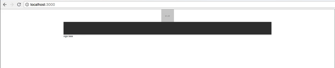
Okay so let's go ahead and go back to our app and make sure this is working. Okay, you'll see they're where they belong.

Now one more layout thing before we get into the forms of our signin and signup components. We need to make this sign innn go in a bit, you'll see that in our design it doesn't go all the way to the left here. It kind of starts let's login and it starts right here.

And the reason we want to take care of this now is because you'll see on the sign up page it's the same, you'll see that in purchase history and account information it's got that inset, you'll see in shop it's got that inset. Basically everywhere in our application has that inset.
So what we want to do is provide some space on these sides and then just say hey this is where it starts and this is where it ends okay so I'm going to go to the login again and I'm going to check that space using the inspect mode here in Invision. You're not going to be able to do this, so just follow along as I get this space out of here, because you shouldn't have access to this or you don't.
Okay so let's say 252 pixels and it's going to be the same on the right, it maybe a bit different in the design but we obviously don't want to make this 249 like the design says and then this side 252. Invision can be off a little bit sometimes, but that's why we're here to kind of fix some of those mistakes while getting some assistance from invision.

So what we want to do is go into our application and let's go into main.scss and let's go into layout.scss. Now right ahead of that start we want to say 250 pixels and right after that end we want to say 250 pixels,that's pretty good estimation. I mean we had a 252 on one side and 249 on the other, let's just go 250 that's a good number.
layout.scss
.layout {
    display: grid;
    grid-template-rows: [header-s] 50px [header-e navbar-s] 50px [navbar-e content-s] 1fr [content-e];
    grid-template-columns: 250px [s] 1fr [e] 250px;
}
Now what we want to do is, check this out, now there's going to be a problem with doing this and it's that when we minimize our application it's still going to be 250 and 250 which is going to be definitely a problem on mobile screens because well a mobile screen is only like 350 pixels or somewhere around there 700 pixels wide right, so it's going to take up all the space.
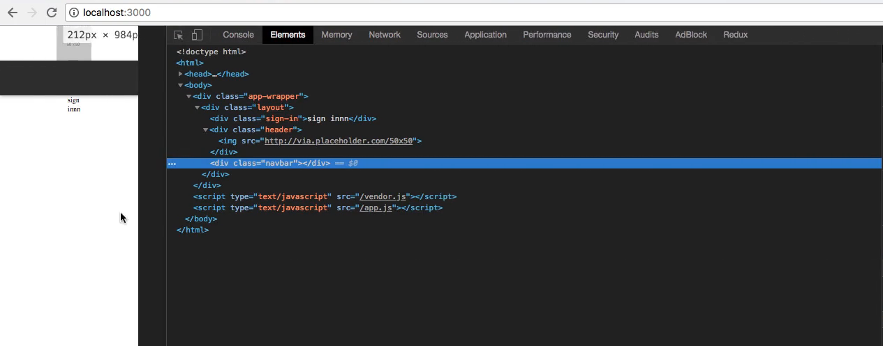
Let's go to Chrome and let's go to our application you'll see there's already an error.

And it's that we didn't really define where this header and navbar belong on the on the column axis, but you'll see our sign innn component is exactly where it should be, it's indented a little bit. So let's go fix our header and our navbar.
Let's go into headernavbar.scss and let's just say on both of these grid column is start end and we don't want to do start to end because you'll see if we do that it's going to start them right there which we don't want.
So this is a good time to say 1/-1, you could even go into where we defined the grid and give them names, I'm just going to go with 1/-1.
headernavbar.scss
.header{
    grid-row: header-s/header-e;
    grid-column: 1/-1;
    display: grid;
    justify-content: center;
}

.navbar {
    grid-row: navbar-s/navbar-e;
    grid-column: 1/-1;
    background-color: #333;
    box-shadow: 0 2px 6px 0 rgba(0,0,0,0.2)
}
Okay that looks good you'll see it's indented now, although when we try to minimize this it is still there, the sign innn doesn't move, we want to minimize that space as we go down. So let's quickly go into layout.scss and instead of saying 250 pixels let's say MinMax 20 pixels 250 pixels. Copy that and replace it on the end here as well.
layout.scss
.layout {
    display: grid;
    grid-template-rows: [header-s] 50px [header-e navbar-s] 50px [navbar-e content-s] 1fr [content-e];
    grid-template-columns: minmax(20px, 250px) [s] 1fr [e] minmax(20px, 250px);
}
So basically what this function is doing is it's saying hey the minimum size can be 20 pixels and the maximum can be 250. So let's stretch out and once we have 500 pixels of space it will stop stretching and then let's stretch down and basically you get the idea. So let's go in Chrome and let's try closing it down. You'll see now that the sides go in until about 20 pixels on each side.
So that's what we want and we might need to adjust that later on maybe give the component a width, but as of right now it looks like it's working really well and it has us in a good spot to change things down the line right, it puts us in a good spot to make things more responsive later on.
Although that's not going to be our main focus, you've probably heard that it's a good idea to make your apps mobile responsive from the get go, that's the case for a lot of people. I enjoy making applications in the website before making them mobile response, I think it's a preference thing.
Let's go out and commit our code and then in the next video we will further develop our core functionality for the authentication features okay, the sign in and sign out, we'll start getting those components on the screen using redux and redux form and all that junk.
Terminal
git status
git add .
git commit -m "built sign in and sign up routes and components"
Okay, I'll see you in the next video.