- Read Tutorial
- Watch Guide Video
In this video, we are going to continue building this component by building out our icon, arrow, and action buttons components. So let's go into our code. Let's create a new file in our coomponents directory and call it icon.js. This will be a simple and functional component. Let's say:
import React from 'react';

const Icon = (icon) => {
    return (
        <div className="icon">

        </div>
    )
}

export default Icon;
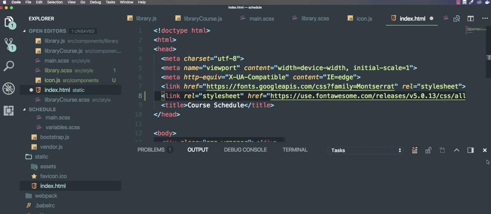
Now we are going to want to take a parameter of the icon name that we want. This is going to be Font Awesome. We have worked with that before, so let's go to FontAwesome.com. Go to Get Started, and copy the CDN link.

Then we are going to paste the link into index.html. Now we just need to use it. So close out index.html and go to icon.js and put one of the icons in there.
Let's tab over to Chrome again and look at the icons. The specific one that we need is a checkmark, so let's search check. This one looks like what we want so let's click on that.

You'll see that it says fas fa-check. So what we want to do is copy that and head back to our code.

In icon.js instead of using a div let's use and i, After we paste it in make sure it is className not class. Then cut out "fas fa-check" and put in {icon} instead.
<i className={icon}></i>
Now we can go into libraryCourse.js and import icon, and insert the icon name like a function under the icon component inside brackets. Now what I want to do is is also give it some parameters like a className. We might want to use this icon elsewhere but we might want to give it custom styling right so let's give it some default styling and custom styling. So put a comma here and then our className variable: let's pass in 'library-course__icon'.

Now we need to go into our icon.js and accept this as a parameter. So let's say className and then what we can do is use string interpolation. So let's put:
<i className={`${icon} ${className}`}></i>
So we are going to have our icon, and then we are going to have styles that we can use and customize for that specific instance of icon. The reason that we are doing this is because we need to put it somewhere on our grid, but we might want to use this somewhere else. So let's go into our libraryCourse.js. Now we can think of this as some thing like this, except for now we can use icon anywhere through our app and give it a title or specific icon and className. Ok so let's do this with an action button instead of making it its own component, but let's check if this is working first and place it on our grid. So lets go into our application in the browser. You can see that we have the check there now, which is really cool.

So lets go ahead and make it for the plus icon that we see in the design here. The plus and the 'x'. This is going to be temporary, we are not going to use it, but I want to show you that it is something that we can do. So lets go into FontAwesome, and go to icons again. Search plus and plus-circle looks good, and we can see that it is fas fa-plus-circle, so we can just copy the string part of it.

Then we can go into our application, and easily just say Icon and paste in fas fa-plus-circle and give it a custom name like library-course__action or something, and then you will see back in our application that we have both of those icons. So I just wanted to show you that by making components you can raise code really easily. Obviously there is not much in here. It would probably be easier to write out the <i> tag.

Again, the reason I am showing you how to do this is so that you can build apps, not so that you can replicate apps I'm building or that anyone else is building. We want to teach you concepts so that you can build applications on your own. So I'm going to get rid of this, and let's move onto the next video where we will build out the arrow component and then go from there.

So let's commit our code. Go to terminal at say git status, git add, and say git commit -m "integrated Fontawesome and built a custom icon component". Okay, see you in the next video.