- Read Tutorial
- Watch Guide Video
Within that component it contains a button which we'll also build and then we'll use to build this other button as well. Let's go into our code and let's close out the archive component and let's create a new component in our newsletter folder.
Let's call it newsletterLatest.js lets import React and component from react and let's say class NewsletterLatest extends Component. Lets say render return div what we want this div to say is we want it to have a class name of newsletter-latest and we finally want to export default newsletter latest.
newsletterLatest.js
import React, { Component } from 'react';

class NewsletterLatest extends Component {
    render() {
        return (
            <div className='newsletter-latest'>

            </div>
        )
    }
}

export default NewsletterLatest;
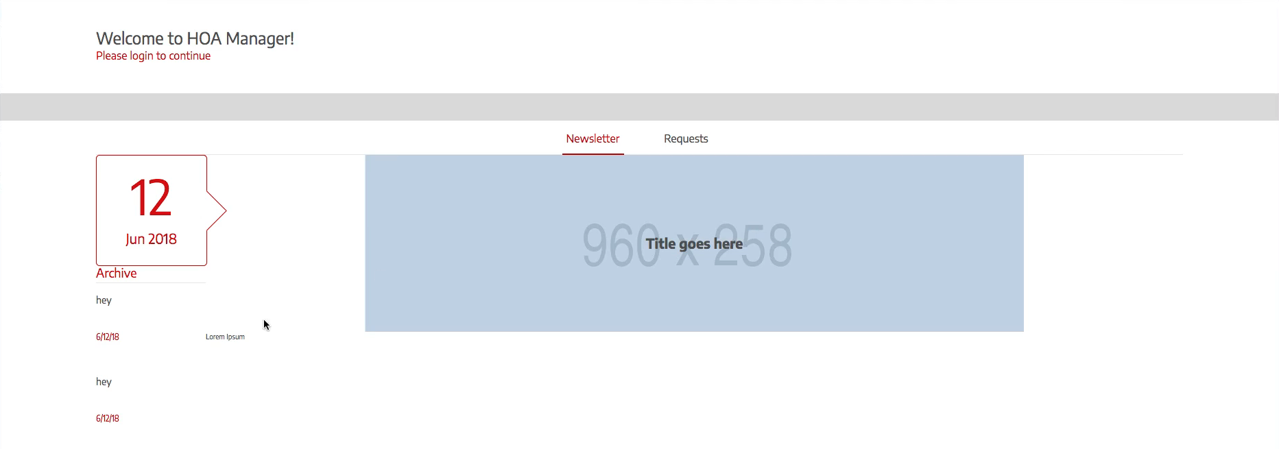
So with this component what we want to do is we want to display an image, a title, and a description so pretty simple stuff. All we have to do is make a grid for that and all that. So let's go into our div and let's say h1 and let's say class name is newsletter-latest_title. Let's make an image say className is newsletter-latest_image.
Let's paragraph and what I want to do is actually wrap this paragraph in a div, let's call it body because that's what it is in the data model on the backend so we're going to call it body. In here, we're going to have a paragraph tag thats going to contain the body.
Now let's put in some content so lorem ipsum just for some latin placeholder text. Okay so let's put in a placeholder for this image. So let's say src is equal to via.placeholder.com/960x258 should be good. And let's just say before this via http://.
newsletterLatest.js
import React, { Component } from 'react';

class NewsletterLatest extends Component {
    render() {
        return (
            <div className='newsletter-latest'>
                <h1 className='newsletter-latest_title'>Title goes here</h1>
                <img className='newsletter-latest__image' src='http://via.placeholder.com/960x258'/>
                <div className='newsletter-latest__body'>
                    <p>Lorem Ipsum</p>
                </div>
            </div>
        )
    }
}

export default NewsletterLatest;
All right excellent so that should be good.
Now let's go ahead and use this in our grid and then put a grid for our latest. So let's get rid of this comment and let's import it so import newsletterLatest from './newsletterLatest'; and let's put it right there.
So this isn't going to automatically just be where it needs to be so let's see where looks like it is in our application, login and you can't even see it. So let's go minimize this and open up our Firefox and see where exists on the grid. All right, so I guess it just hadn't reloaded in Chrome.
So what we need to do is just explicitly declare where we want this on the grid even though it's basically right there. If we inspect it in Firefox we can get the grid tools, okay it says css is not used on this page which is a bunch of lies, so let's reload it. OK let's try this okay so we've got newsletter-grid so that should be good.
Now what we want it to do is not be there because that looks terrible and we want to put it basically all over the place. So let's go into our code and let's go into newletterLatest and let's grab this class name and create a file with the same name. So I'm gonna say new file in style and I'm going to name it newsletter-latest.scss. And again put the class there, and let's put it on the grid.
So we want to go to our newsletter grid.scss and see where we want it to belong. Okay, so we want it on newsletter start to end, and what we'll do is we'll just call this latest start to latest end. And then where we want it on the rows is from start to end so we'll just leave that.
newsletter-grid.scss
.newsletter-grid {
    grid-row: conten-s/content-e;
    // height: 100%
    display: grid;
    grid-template-rows: [s box-s] 16rem [box-e archive-s] 1fr [archive-e e];
    grid-template-columns: [box-s archive-s] 16rem [box-e archive-e latest-s] 1fr [latest-e];
}
So grid row, we want it to belong from grid start to grid column latest start to latest end.
newsletter-latest.scss
.newsletter-latest {
    grid-row: s/e;
    grid-column: latest-s/latest-e;
}
So it's probably not going to move much but it's going to be on the grid, so no matter what we do it's always going to be there no matter what else we add so it's where we want it on the grid. Now what I want to do is basically increase the height so it's not just subject to how big the description is.
So let's say height: 100%;. So since we're using a fractional unit it's not going to do that. So what we'll have to do is say the height of the grid is 100 percent, so grid height is 100 percent and that will fill it up.
newsletter-grid.scss
.newsletter-grid {
    grid-row: conten-s/content-e;
    height: 100%
    display: grid;
    grid-template-rows: [s box-s] 16rem [box-e archive-s] 1fr [archive-e e];
    grid-template-columns: [box-s archive-s] 16rem [box-e archive-e latest-s] 1fr [latest-e];
}
Now you'll see it at 100 percent, now the problem with this is that our archive component will stretch all the way to the bottom. So there's two things we can do, we can either forget about what we just did because it really doesn't matter. It's going to it's going to be whatever it is anyway to fill up the description or we can go into our archives component and say hey don't stretch to the bottom, let's do number two.
So I'm going to go into newsletter-archive.scss and just say that the row is just archive start and thats it. All right, never mind on that one, let's do this. Hit command + z so the archive row is there. So let's go into our newsletter-grid.scss and let's say that, well let's introduce another column let's end the archive there and let's end the end here.
We'll put a 1fr here and then we'll change the archive to 16rem for 160 pixels not 16rem because it still needs to fill up as large as it needs to fill up. So really all we need to do is, let's just go with the first method because this is going to get confusing.
Let's leave the height at nothing, let's not set the height and let's just go with this because it's really going to fill up to how ever large it needs. We'll make adjustments if we need to, but this should work just fine, it really looks the same. So let's style this component now, I'm going to go in and select the appropriate grid so the newsletter-archive and we haven't made it a grid yet so we can't really select it.
So let's go into our newsletter-latest and say display is grid and let's say grid template rows and we basically only want two rows in here because we want the title to belong in the same row as the image because in the design it's over it and in here it's about 258 pixels high so that's how we'll make it.
And this one is the remaining content which we will make 665 pixels minus the height of this so it's 406.5 pixels as you can see. So let's go do that so let's say 258 and 405 pixels that should be good. And then let's just say image start let's just say start to middle to end because it's not too much going on in here. Now let's say the columns we only need one start to end.
newsletter-latest.scss
.newsletter-latest {
    grid-row: s/e;
    grid-template-rows: [s] 258px [m] 405px [e];
    grid-template-columns: [s] 1fr [e];
}
Let's go see what it looks like it's not going to look great. It's probably going to fit the image here and the title here and then do nothing with the paragraph or put it our third one that doesn't exist. Let me select, okay so we probably haven't imported it so let's make sure we're importing latest into our main.scss.
main.scss
// BASE
@import 'variables';
@import 'base';

// HEADER
@import 'header';

// AUTH
@import 'signin';
@import 'signup';

// HELPERS
@import 'form-title';
@import 'form-fields';
@import 'text-link';

// DASHBOARD
@import 'dashboard';
@import 'tab-nav';

// NEWSLETTERS
@import 'newsletter-grid';
@import 'newsletter-box';
@import 'newsletter-archive';
@import 'newsletter-latest';
All right sweet, so that's kind of working but not really. And you'll see that we have an extra row its putting the image right here but we actually want the image in here above it and we want the title with the image. It also kind of most of our archive but we'll come back to that.
So let's specify where these go manually which is what we were going to do anyway. Let's go to the latest.scss and let's say image right above that and let's say title and let's say and body. And then in the body we have a paragraph tag.
So what we want to do is say the body belongs on grid row end to end and the image belongs on grid row S to M and the title also belongs on grid row s to m and they all belong on the grid column ste. So let's just grab all of them and let's say > * and this will grab basically all of these and we just want to say grid row grid column is start to end.
newsletter-latest.scss
.newsletter-latest {
    grid-row: s/e;
    grid-column: latest-s/latest-e;

    display: grid;
    grid-template-rows: [s] 258px [m] 405px [e];
    grid-template-columns: [s] 1fr [e];


    & > * {
        grid-column: s/e;
    }

    &__title {
        grid-row: s/m;
    }
    &__image {
        grid-row: s/m;
    }
    &__body {
        grid-row: m/e;
        p {

        }
    }
}
Now if we close up the terminal we can see the code better and I'll open it up in the browser and we'll see what it looks like.

Okay cool it looks great except for our title is kind of missing and thats because it's behind our image. So we just have to set the z index of the image to like negative 10 or something just so its behind everything. So let's go in the image and let's say the z index is minus 10 and it can be like minus 50 whatever it just needs to be minus because we don't have anything else set on the z index so it will be behind everything.
newsletter-latest.scss
    &__image {
        grid-row: s/m;
        z-index: -10;
    }
Now let's open Firefox and you'll see the titles in front now.

Okay, so that's sweet. That gets our grid in there pretty well, let's center this now because these are not in the middle. Let's center everything on the grid and let me pull up the console real quick so I can show you the grid here. So we have our grid we want to center them in those. So pretty simple stuff.
All we need to do is go into our code and say justify item center and that will center it on the row access. Now we want to center it on the title, but we don't really want to center the description any way, we only want to apply padding to that. So what we'll do is only apply it to the image and the title.
So let's go back into our code and let's get rid of justify items and let's say &title &image. And let's say justify items center and align, well that's not going to work items because that's no longer on the grid that's on specific items so we have to say self.
newsletter-latest.scss
& > * {
    grid-column: s/e;
}

&__title,
&__image {
    justify-items: center;
    align-self: center;
}

&__title {
    grid-row: s/m;
}
&__image {
    grid-row: s/m;
    z-index: -10;
}
&__body {
    grid-row: m/e;
    p {

    }
}
Let's go to the browser and you'll see it looks like what we want.
OK, so the problem with this is that the description extends past the image. So let's go ahead and specify that this entire row here or column on our layout grid on our newsletter grid is 960 pixels. So let's go into our code and let's go to newsletter-grid.scss and we'll say that the latest instead of being 1fr let's say that it has to be 960 pixels.
newsletter-grid.scss
.newsletter-grid {
    grid-row: content-s/content-e;
    // height: 100%;
    display: grid;
    grid-template-rows: [s box-s] 16rem [box-e archive-s] 1fr [archive-e e];
    grid-template-columns: [box-s archive-s] 16rem [box-e archive-e latest-s] 960px [latest-e];
}
Alright, let's go ahead and go into Firefox and see what it looks like, okay it looks good.

Now this is good except for now doesn't look centered but it's centered within its own grid just the entire grid itself isn't centered now. So let's open up Firefox dev tools, and lets select the newsletter grid and you'll see that it is no longer centered.

Actually it never was because it was always the width of the screen but if you go to newsletter latest you'll see everything fits in there nicely.

So let's end the video after we center the newsletter grid using justify content. I'm going to go into the code I'm going to go to newsletter-grid.scss and I'm going to say justify content center.
newsletter-grid.scss
.newsletter-grid {
    grid-row: content-s/content-e;
    // height: 100%;
    display: grid;
    grid-template-rows: [s box-s] 16rem [box-e archive-s] 1fr [archive-e e];
    grid-template-columns: [box-s archive-s] 16rem [box-e archive-e latest-s] 960px [latest-e];

    justify-content: center;
}
And boom it's in the center.

Okay, so that looks really good. Now let's go ahead and end the video because it's getting really long and let's continue styling these grids in the next video. So lets get into the terminal and commit our code.
Terminal
git status
git add .
git commit -m "built newsletter latest component and grid and refactored newsletter-grid slightly"