- Read Tutorial
- Watch Guide Video
In this video we're going to start by styling our date picker. So let's go back to the react date picker. And you'll see that they are importing these styles here, so let's go ahead and copy this link.

and paste it into an application picker.js
picker.js
import React, { Componet } from "react";

import DatePicker from "react-datepicker";
import moment from "moment";

import 'react-datepicker/dist/react-datepicker.css';
I'm going to separate it just because its a style sheet. And let's go ahead and open up our page, let's select it, and you'll see that we have our styles,really simple really awesome and this is why I love the internet.

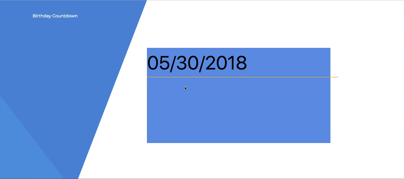
So let's go ahead and basically add in the styles for our actual picker so what you see in the design

Then I'm going to go to my code and I'm just going to remember that we call it picker. And then just know that this date picker is basically just an input, it uses an input. If you command click into it, it might have an interface here, but basically if you've done C++ or worked with interface files, you'll probably know what this is.
Okay, so let's go ahead and go to picker.scss and then in .picker let's just say input and then let's start off by saying border none.
picker.scss
.picker {
  grid-column: 5/10;
  grid-row: 2/4;
  background: cornflowerblue;

  input {
    border: none;
  }
}
And then let's go back to our page and you'll see that that got rid of the border around our date.

Now, let's change our back ground color to clear, so let's say background-color: transparent;
picker.scss
.picker {
  grid-column: 5/10;
  grid-row: 2/4;
  background: cornflowerblue;

  input {
    border: none;
    background-color: transparent;
  }
}
Alright and that's looking nice. Now let's give it a border bottom, so we'll say border-bottom: 2px solid #E3B924; and that should give us a gold look, and you'll see we have that border now.

And it looks very similar to this border on our design

Let's go back to our application and let's increase the font size and all that junk. So let's go in here and we can just place that in the .picker. And we can just say font-size of anything in this .picker div is going to be 80px.
Okay, that will increase the size of our font.
okay so you can kind of tell where this is going. Now let's center it and get rid of this background color. So what I'm going to do is comment out the background color. And then let's center the text in our input.
picker.scss
.picker {
  grid-column: 5/10;
  grid-row: 2/4;
  // background: cornflowerblue;
  font-size: 80px;

  input {
    text-align: center;
    border: none;
    background-color: transparent;
    border-bottom: 2px solid #E3B924;
  }
}
Okay, that looks really good actually.

And then I don't want this input selected kind of thing going on there.

So let's go into our input and say &:focus { outline: none; }.
picker.scss
input {
  text-align: center;
  border: none;
  background-color: transparent;
  border-bottom: 2px solid #E3B924;
  &:focus {
    outline: none;
  }
}
So doing that selector is exactly like saying
input:focus {
  outline: none;
}
So that's the same thing except for with SCSS we can just nest that in there and make it nice, which makes it more condensed and readable code, so that looks really good.

Now what I want to do is put in a custom font, so go ahead and go to google fonts and then in here we want to basically select one of these fonts. So I want to use Roboto condensed, so let's select this one. And I think that's the exact one used in the birthday count count down if I remember from the first time recording it.
Now remember that we are using another font which is Montserrat in one of our styles here, and if you go to our index.html you'll see we have an import to that. So what I want to do is in google fonts before we copy this link let's just search in here for that font.
Okay, that's a really clean font because we're going to be using that as well. Now were going to be coming back here, I think I remember the other font as well so let's just do it now as well. It's called Alegraya we are going to be using this one as well, so let's throw that in.
And then let's customize these, you'll see that there is a customize tab.

In our application we have some bolded fonts, if we don't customize it we're going to get all these thin looking fonts so let's go in here and hit customize, and let's select bold and that should be good.

Now if we need more we can come back here. Okay, so now go back to embed and let's copy this link.

And then let's replace this one in our index.html with it
index.html
<!doctype html>
<html>
<head>
  <meta charset="utf-8">
  <meta name="viewport" content="width=device-width, initial-scale=1">
  <meta http-equiv="X-UA-Compatible" content="IE=edge">
  <link href="https://fonts.googleapis.com/css?family=Alegreya|Montserrat|Roboto+Condensed:400,700" rel="stylesheet">
  <title>Birthday Countdown</title>
</head>

<body>
  <div class="app-wrapper"></div>
</body>

</html>
Sweet so we have all of our fonts, we've got some font sizes on these and it should be good. So let's go ahead and go to picker, and let's put a font on our picker so let's say font-family: "Roboto Condensed"; and then let's say font-weight: bold; or you can just say 700 or what ever it was. Because you'll see in our index.html that we are saying 700, when you say bold in SCSS that's just translating to 700, so if you put 700 thats going to be the same thing.
I'm just going to put bold and I haven't saved it yet I want to see if it changes. So I'm going to save it and alright it looks the same to me, and that is because it is the same thing. So let's just put 100 for the font weight and then let's go and see if it changes, huh it doesn't look like it changed to me.
Let's just put it to 700 or bold for now, and we'll fix that later on if it's not looking like our design at the end of the app, and with Roboto Condensed it looks like we are using it correctly.
Anyway, thats how you do that. So let's go ahead and give it a padding bottom of 50px, now the reason we're doing this is because when we put the button in, the way its going to align on our grid is going to be right up to this gold line so we just want to throw 50px so it throws it above
If we go to our tab that is inspecting it you will see that its above 50px and then we can just throw our generate button right here.

I'm going to go back to this tab and you can kind of see that we've styled this now and it looks really nice, it looks almost identical to what we have in the design. So what I'm going to do is give it a color now, because the design date looks a little grayer then the black we are using in our app.
So let's go in to picker.scss and let's say color: #444;. Now I want to put this in a variable so let's just cut that and let's say color-gray-one.
And then let's go back to our base.scss and at the top by the other two color variables let's say color-gray-one: #444;. Now we can use this where ever we want, because I'm pretty sure that we are going to be using this in several different places.
Now, let's go back to our application and see what we've got, and let's compare it to our design.
our app

the design

Okay that's looking pretty close, obviously the font is looking pretty different. I believe I can inspect this and see what they are using for a font, it looks like they are using roboto condensed and they are using bold, okay so that is exactly what we used.
That is interesting I wonder why that is not working, let's go and inspect our element in our page and see what we get. Okay let's select the same date because that could be part of the reason, okay that looks different to me.
Let's inspect it and you'll see that we are using on the input, okay we've killed our borders which we want, I'm not seeing the font. So what we can try and do is go to our picker and let's just try putting these directly into our input, and you'll see that the color is not translating over either.
So let's go into picker.scss and let's put this color right after our font-weight and then let's take this block from color up to font-size and throw it into our input.
picker.scss
.picker {
  grid-column: 5/10;
  grid-row: 2/4;
  // background: cornflowerblue;

  padding-bottom: 50px;


  input {
    font-size: 80px;
    font-family: "Roboto Condensed";
    font-weight: bold;

    color: $color-gray-one;
    text-align: center;
    border: none;
    background-color: transparent;
    border-bottom: 2px solid #E3B924;
    &:focus {
      outline: none;
    }
  }
}
Okay, that looks much better that is looking like what we want.

And I think that kind of sets up our styles for that, and that looks really nice to me. It almost looks to thick but I think thats the same as our design. Okay so let's end the guide here and then in the next video we will get into our generate button component.
And we are going to do this with a different style component, and I said that every time we build a component we're going to build it out kind of like we did with our picker.js except for we are going to learn about a functional component in the next video, so let's commit our code and then do that.
Terminal
git status
git add .
git commit -m "styled picker"
git push origin master
Now I totally forgot that we pushed to Heroku earlier, I didn't just push to heroku but we should go test that out and make sure its working. So if we go to our browser and go to our heroku app, you will see thats what we pushed up to heroku.
If you want to push up to heroku now you can and you will see the date picker but its totally up to you. But I'm going to move on to the next video where we will put in the generate button component.