- Read Tutorial
- Watch Guide Video
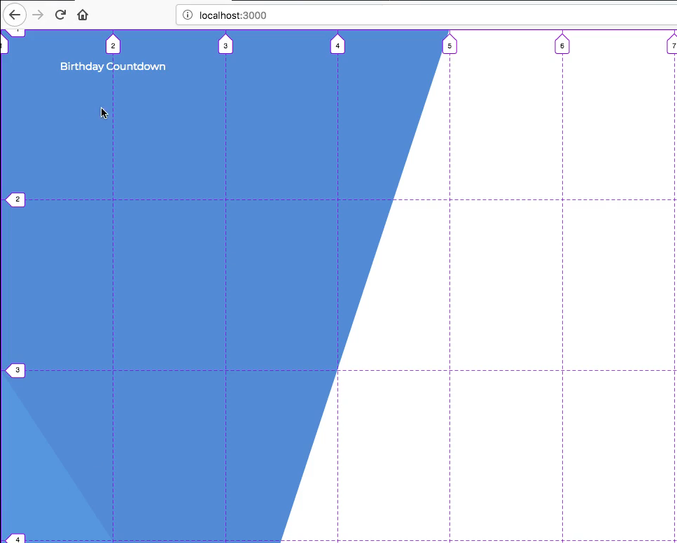
So what we want to do is go to our application and close the terminal here so we can see our code. And I'm going to go to app.js and I'm going to put this div in our grid here. So I'm going to say <h1 className="grid__title">Birthday Countdown</h1>.
Now if you don't do anything we might not see that yet, actually we might because we put it on the back. Okay, so you'll see that it's right here.

So what I want to do is basically place it over here in row 1 column 2. So let's do this, let's place it where our design says okay so this is going to be a little tricky but I'm going to say the row is 2/3 for now.
That's exactly where we want to place it, actually we want to place it from 1 to 2 because you'll see it extends a bit on their design over but it still reaches over to the end here.

So lets put it like right here going along 1 and 2 and then about halfway down this first row, and we will be introducing a couple CSS grid things to do that. So let's go into our code and lets go into base.scss and then in grid let's just say &__title.
And then let's provide the grid row property and we want it to be from 1/2, and automatically it will set to that, but then for the column we need to move it to grid column 1/3.
base.scss
$color-blue-one: #5496E6;
$color-blue-two: #518BDE;

.grid {
  height: 100vh;
  width: 100vw;

  display: grid;
  grid-template-rows: repeat(4, minmax(200px, 1fr));
  grid-template-columns: repeat(11, minmax(150px, 1fr));

  &__title {
    grid-row: 1/2;
    grid-column: 1/3;
  }
}
Now, you'll see that it moves that and it looks like its behind our skew. So let's go to our code and let's go to clippaths.scss and on skew-dark-one-box let's just go to the top and give it a z index of -10 and that will throw the skew behind our label here.
clippaths.scss
.grid {
  &__skew-dark-one-box {
    z-index: -10;

    background-color: $color-blue-two;
    grid-column: 1/3;
    grid-row: 1/5;
  }
}

Now we just need to place this differently, so if I go to chrome and I go to A Complete Guide to Grid and I hit command + f and I type in justify-content, you'll see that we have all these options.
So basically we can place our items or our entire grid where we want. So this isn't what we'd want to use, we'd want to use justify-items. Now if we use justify-items it's going to align everything in our grid. So you'll see that it aligns all of the grid items and it will put it right in the middle.
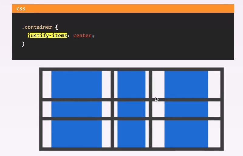
Now this is probably really confusing to you right now. So what we want to use is justify-self because this is going to allow us to specify one element, so let's go to our code and I'll show you what we are going to do.
So let's go to base.scss and in &__title lets say justify-self: center;. Okay let's go back to the app and you'll see that it puts it in the middle of these columns.

Now if we do align-self its going to put it in the middle of the row, so let's say align-self: center;. And now you will see that it puts it right there.

So we obviously want it to be a little bit here so what we could do is add more columns or we could just add in some more padding instead of using justify and align. So let's get rid of these justify and align statements or comment them out rather.
It's going to put it right there on the top. I'm going to kind of move this webpage around just so I can click between these rather than having to throw it up every now and then because it's probably really throwing you off.
Anyway, we're back here on Firefox for the grid. Now let's just use some padding, so for the first one I want to use justify-self because that's pretty helpful and I'll put it right there. So now let's use padding, so the padding is 40px and let's see what that gets us.

Alright, that looks good although it looks like it's not wide enough now. So what we can do is instead of specifying it all around as top left bottom and right as 40px. What we can do is say padding top and padding left is 40px that way we don't have to have padding on the right and bottom.
So its still doing that, but this will change once we had in the correct font size, so let's do that now. So let's just say font-size: and I'm not sure what I want to use exactly but let's try 18px okay so that position looks better but that looks really really small to me.

So let's do like 24px maybe, okay so 24 is good. I'm going to add in a few more styles because you'll see that it works now, that's exactly where we want it.

So let's make it white and let's put in the correct font so the font family is Montserrat so where were getting this font is in our index.html and we are importing it from google fonts, now let's say font weight of 300.
base.scss
font-size: 24px;
color: white;
font-family: 'Monserrat';
font-weight: 300;
That looks really clean,

Now, it might actually be a little bit big you can see our design is quite a bit smaller so let's go ahead and stick with 18.
So basically what I want to do is when I'm coding, I'm going to refer to Firefox for the grid and them I'm going to refer to chrome for all of the specific styles like what we are doing here, because I feel like Chrome handles them better and it makes things easier.
We're obviously going to optimize it for both browsers but Chrome is my preferred browser. I'm only using Firefox for grid. Now let's do this, let's say line height is 22px and then for the padding, I'm just going to get rid of this padding up here and I'm going to put it down here and say padding is 55px 75px.
base.scss
font-size: 24px;
color: white;
font-family: 'Monserrat';
font-weight: 300;
line-height: 22px;
padding: 55px 75px;
And that will put it in a really good spot. Okay, yeah that looks good, so that's how you do that.
It looks like its a little bit to large here so we can extend it a bit. We can say the grid column extends to 4 and that will throw it over a bit.

There we go, that's looking good. It's extending over that second column. So what I want to do now is develop our first component, let's commit our code and develop that in the next video. And this is a good time to push this up to github so let's do that as well.
Now pushing it up to github won't update this on heroku so if you try to visit your app on Heroku it's not going to do anything and thats because we pushed it specifically to origin and not to Heroku. So lets also say git push heroku master, and that will throw it up on Heroku as well.
Terminal
git status
git add .
git commit -m "added birhtday countdown title"
git push origin master
git push heroku master
So now, if you go to your app on heroku if you remember where that origin url is, you can view it once this is done pushing it up. But I'll just do that in the next video because this is going to take a minute to push, so I'll see you in the next video.