- Read Tutorial
- Watch Guide Video
So in this video we're going to start building out our application. We're going to specifically start by laying out our grid for our schemas, so again we're using CSS grid. So I'm going to go to this url bennettfeely.com/clippy and just make sure that you put that in your browser and we are going to be using this tool to generate our clip paths, this is a really awesome tool that some developer made and it really helps.
So select the one we need which should be trapizoid, well we actually want to select triangle and go from there.

If you look at our application let's just think about how we are going to build this. We have all these clip paths here okay, and what you might think is okay we can put one here and another one here. And thats true we can, we can manipulate these to look like this.

And so we can put this in there and then we can put another one above it, and that would work great. But it makes it harder to have other things work because if we don't do it a certain way with grid its going to get really complicated. Because when you generate a count down and you'll see we have this one right here.

and its perfectly aligned from the bottom left corner. So the approach we need to take is we need to build a grid and we need to but a box here and then we need to put another box here and we need to put our clip paths in separate boxes.
So basically this lighter skew is going to be composed of 3 divs this top part will be one, then a square in the bottom left corner and then the third one will be a triangle on the bottom right. You can kind of see the direction this is going this is going to be a grid, so think of this as three boxes and only half of this is filled up in these two boxes.

Now that might be really confusing, but I promise that once we get into the count down skew its going to make things really easy for us to line things up and make it look really nice. Let's go ahead and get started with our grid by going to our code here and opening up our app.js and let's get rid of this h1 for now, then lets name this grid className is grid.
app.js
import React, { Component } from 'react';

export dafault class App extends Component {
  render() {
    return (
        <div className="grid">

        </div>
    );
  }
}
Now if we go to our application browser, we won't see anything when we inspect the element. But if we go to our main.scss here, and we type in .grid and we say display is grid, then we say grid template rows and then we say 1fr 1fr 1fr.
main.scss
.grid {
    display: grid;
    grid-template-rows: 1fr 1fr 1fr;
}
Then let's save that and open our application, I'm specifically opening this up in Firefox because Firefox has really good dev tools only for CSS grid that's literally the only thing I use Firefox for.
So in localhost:3000 our birthday countdown you won't see anything, but when you inspect the element you still wont see anything but the dev tools will pop up.

And you will see we have layout and grid, now if you select layout we should have some rows here but it doesn't look like we do. So let's go ahead and go back to, okay so we might need to select these three options under the Grid Display Settings, and we don't okay I'm going to leave those selected but what we need to do is go to our application.
Then go to main.scss and we need to give this a background color and lets say background color is crimson and let's see if that changes it. Because I'm pretty sure we should be displaying that grid there, alright so it's not displaying anything, let's check why.
Okay, so its probably because we don't have a height and width so let's say height is 100vh and width is 100vw. Now this is much different than percent but we are not going to talk about that.
Okay so we now have that background color.

Let's go back to our code and get rid of that background color, and see if we can see our rows. Alright so that doesn't look like its appearing so let's go ahead and put some code in our div in the app.js file. So lets put three div's in and just say hi in each one.
app.js
import React, { Component } from 'react';

export dafault class App extends Component {
  render() {
    return (
        <div className="grid">
                    <div>hi</div>
                    <div>hi</div>
                    <div>hi</div>
        </div>
    );
  }
}
Lets save that and then reload the application and you will now see that we have our grid.

You'll see our layout consists of three rows and that's because we specifically defined three rows in the grid-template-rows. Another way to write that would just be grid-template-rows: repeat(3, 1fr); which does the same exact thing it just repeats that 3 times.
Now, let's go back to our code and let's put in some columns. So I'm just going to say grid-template-columns: repeat(10, 1fr);. Now the reason I'm doing 10 is because we are going to need all of these to place things where we want.

Now you might think this is unnecessary but just hang on, you'll come to realize that its very necessary. Okay so now what you can see is we have these three boxes here.

Now if you look back at our design I'll just kind of shrink this and I'll open up Chrome to the left a little bit and then I'll go to our design. Okay so you'll see our three boxes, you can see okay we can have three skews in here thats going to make our lines.
So let's go ahead and throw those on screen and I'm going to go back to the start screen. So let's go to our clippy resource here and let's make these. So we just need this one and then a box, so this is the only clip path we need.
We're going to just copy this bottom one, we are not going to worry about webkit yet, well we'll copy both of these just in case. And you are going to want to include webkit as well to make it cross browser compatible, I'm pretty sure clip paths work on most browsers anyway.
So let's go ahead and go to our code and then down at the bottom of main.scss lets say . and then we want to basically provide our first skew so we'll call these skew-light and then -1 so that is going to be our first one.
Now if you past that in there we'll get the clip path although we don't have a couple things, we don't have the div and we don't have the background color. So let's go to our app.js and lets put another div in here and let's say className is equal to and then what I'm going to show you is some nice sass syntax so what we're going to want to do is say grid__skew-light-one.
Now what we can do is basically just do this we can say &__ and put this within our grid here.
main.scss
.grid {
    height: 100vh;
    width: 100vw;

    display: grid;
    grid-template-rows: repeat(3, 1fr);
    grid-template-columns: reapeat(10, 1fr);

    &__skew-light-one {
        -webkit-clip-path: polygon(0 0, 0% 100%, 100% 100%);
        clip-path: polygon(0 0, 0% 100%, 100% 100%);
    }
}
Now let's go ahead and give this a background color, so I'm going to grab it from the design. I'm going to go into birthday countdown I'm going to hit this inspect, you don't have access to this so you'll just have to type it in. It looks like I don't even have the color on this but what I can do is use an app that I downloaded that I use quite often, and I can select this and use it to find the color.
You can't see it, its off my screen but that allows me to copy colors. Okay so now what you want to do is just say background-color: #5496E6; and then what we have to do is place it, because if you go to our application it's going to look like it's not in the right place you'll see that it says hi hi and hi. And let me get rid of some of these things.
Okay so you'll see this, so it says hi hi hi and then our skew.

So basically what we want to do is place this in our three squares. So let's go ahead and learn how we can do that, its pretty simple and the first thing we want to do is increase these rows a bit. So let's go to our code and instead of 3 lets say 5 in our grid template rows.
Alright so what we want to do now is basically tell it where we want to put it, so let's go to our code here and think about where we want to put it, we want to extend it from about here to here.

So I'm going to reduce this to 4 and let's just make this better so let's get rid of 1fr and let's say minmax 200px, 1fr
main.scss
grid-template-rows: repeat(4, minmax(200px, 1fr));
basically what we are doing here is saying okay it can only be 200px and no smaller it can be 1fr but it cant be any smaller then 200px. And that was kind of unnecessary at this point but basically it just makes it so we can't resize it any smaller.
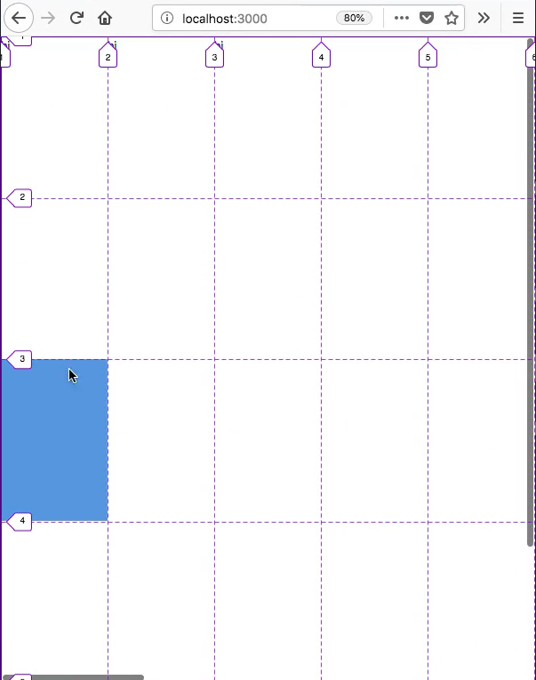
So let's go ahead and let's just place it down here on this third square, so if you're in Firefox and you're using these tools which you don't have to be, but it might help, if you select display line numbers you'll see that we have numbers here.

We can use these to our advantage so we want to put it from 3 to 4 on our row axis and then from 1 to 2 on our column axis. So let's go into main.scss and say grid-column 1/2 and grid-row 3/4. And if you look at Firefox you will see that it places it there.

So again all I did to do that was this
main.scss
grid-column: 1/2;
grid-row: 3/4;
Okay, now I don't like the way this is resizing that's obviously not going to look good in your application so we need to do the same thing with minmax but on our columns so I'm going to do this.
main.scss
.grid {
    height: 100vh;
    width: 100vw;

    display: grid;
    grid-template-rows: repeat(4, minmax(200px, 1fr));
    grid-template-columns: reapeat(11, minmax(150px, 1fr));

    &__skew-light-one {
        -webkit-clip-path: polygon(0 0, 0% 100%, 100% 100%);
        clip-path: polygon(0 0, 0% 100%, 100% 100%);
        background-color: #5496E6

        grid-column: 1/2;
        grid-row: 3/4;
    }
}
Now back in Firefox you'll see it doesn't squish the size obviously this is going to prevent us from making a completely mobile responsive application but there's a way around that which I will show you more towards the end of this project.
So thats how you do that, let's go ahead and put in the rest of the skews right now. So we only need this skew at the last row second column and then we just need a box on the last row first column.
So let's add in the divs, I'm just going to copy our div and make three of them. Then I'm just going to say skew-light-one and then two and three. Now obviously one of these is going to be a box but I want to keep this naming convention.
app.js
import React, { Componet } from 'react';

export default class App extends Component {
    render() {
        return (
            <div className="grid">
                <div>hi</div>
                <div>hi</div>
                <div>hi</div>
                <div className="grid__skew-light-one"></div>
                <div className="grid__skew-light-two"></div>
                <div className="grid__skew-light-three"></div>
            </div>
        );
    }
}
So in our main.scss I'm just going to copy this &__skew-light-one twice and then I'm going to say two and three and then just so we really know lets put -box on this last one.
main.scss
.grid {
    height: 100vh;
    width: 100vw;

    display: grid;
    grid-template-rows: repeat(4, minmax(200px, 1fr));
    grid-template-columns: reapeat(11, minmax(150px, 1fr));

    &__skew-light-one {
        -webkit-clip-path: polygon(0 0, 0% 100%, 100% 100%);
        clip-path: polygon(0 0, 0% 100%, 100% 100%);
        background-color: #5496E6

        grid-column: 1/2;
        grid-row: 3/4;
    }
    &__skew-light-two {
        -webkit-clip-path: polygon(0 0, 0% 100%, 100% 100%);
        clip-path: polygon(0 0, 0% 100%, 100% 100%);
        background-color: #5496E6

        grid-column: 1/2;
        grid-row: 3/4;
    }
    &__skew-light-three-box {
        -webkit-clip-path: polygon(0 0, 0% 100%, 100% 100%);
        clip-path: polygon(0 0, 0% 100%, 100% 100%);
        background-color: #5496E6

        grid-column: 1/2;
        grid-row: 3/4;
    }
}
And then lets go back to our app.js and put -box after our third skew.
app.js
import React, { Componet } from 'react';

export default class App extends Component {
    render() {
        return (
            <div className="grid">
                <div>hi</div>
                <div>hi</div>
                <div>hi</div>
                <div className="grid__skew-light-one"></div>
                <div className="grid__skew-light-two"></div>
                <div className="grid__skew-light-three-box"></div>
            </div>
        );
    }
}
So now what we need to do is we don't need the clip path on our box of course, and we want to place it else where. Because now what you'll see is because we don't have the skew in here and since they're all on top of each other it's just going to look like we changed our skew into a box.
So let's go ahead and move these, we want the box to be on row 4/5 we don't want to change the column so lets just put grid row 4/5. And that will push it down and then now what we need to do is move this other skew down to this other square so from 4/5 on the row and from 2/3 on the column.
main.scss
.grid {
    height: 100vh;
    width: 100vw;

    display: grid;
    grid-template-rows: repeat(4, minmax(200px, 1fr));
    grid-template-columns: reapeat(11, minmax(150px, 1fr));

    &__skew-light-one {
        -webkit-clip-path: polygon(0 0, 0% 100%, 100% 100%);
        clip-path: polygon(0 0, 0% 100%, 100% 100%);
        background-color: #5496E6

        grid-column: 1/2;
        grid-row: 3/4;
    }
    &__skew-light-two {
        -webkit-clip-path: polygon(0 0, 0% 100%, 100% 100%);
        clip-path: polygon(0 0, 0% 100%, 100% 100%);
        background-color: #5496E6

        grid-column: 2/3;
        grid-row: 4/5;
    }
    &__skew-light-three-box {
        background-color: #5496E6

        grid-column: 1/2;
        grid-row: 4/5;
    }
}
And you'll see we have our first set of skews in place and it looks really great.

Now what we need to do is look at our design and just add in this big skew in the next video. So I'll see you then, but first let's commit our code.
Terminal
git status
git add .
git commit -m "added first set of skews"