- Read Tutorial
- Watch Guide Video
- Complete the Exercise
This is going to be another really good guide because this is going to be a task that you're most likely going to have to implement in some form or another.
Let's switch back to our app, and then go to the code. Let's start off by adding our content. So you can see this is the skewed header portion. We want to come down below that. I'm going to create a page container class here.
about.html
<div class="page-container">
    <div class="content-wrapper">
        <!-- IMG goes here -->
    </div>
</div>
This is where we'll have the image, and where we'll also have all the content.
Now, we can go and add our paragraph tags. So we have a few different types of ways we could do it. You could type a lot of content, you could copy and paste. But I find it's the fastest to use the Emmet tool. So I'm going to type p>lorem200
Then if I hit tab, this is going to give us lorem ipsum text with 200 words. Let's do the same thing, except this time, we're going to want a different number of words, say, 350 words. p>lorem350
about.html
<div class="page-container">
    <div class="content-wrapper">
        <!-- IMG goes here -->

        <p>Lorem ipsum dolor sit amet, consectetur adipisicing elit. Dicta provident sunt laudantium fuga repudiandae, nulla! Debitis ullam culpa incidunt quo voluptatibus deserunt, quia velit, eaque quaerat iste consequuntur, explicabo voluptate voluptates dolor dignissimos illum doloribus distinctio mollitia quam laboriosam. Optio possimus vitae a. Dolore obcaecati animi non sit nemo, iusto debitis quos tempora temporibus veniam, accusantium est deserunt aperiam, reprehenderit sed dolorem reprehenderit officiis vero corporis totam adipisci perspiciatis atque cum architecto voluptatem!</p>

        <p>Lorem ipsum dolor sit amet, consectetur adipisicing elit. Dicta provident sunt laudantium fuga repudiandae, nulla! Debitis ullam culpa incidunt quo voluptatibus deserunt, quia velit, eaque quaerat iste consequuntur, explicabo voluptate voluptates dolor dignissimos illum doloribus distinctio mollitia quam laboriosam. Optio possimus vitae a. Dolore obcaecati animi non sit nemo, iusto debitis quos tempora temporibus veniam, accusantium est deserunt aperiam, reprehenderit soluta odit. Sint ex odio delectus, harum, in voluptatem, explicabo aliquid unde est temporibus iusto asperiores soluta ratione excepturi iste reiciendis. Id, odio officia ea. Iusto ex cumque sapiente quae animi nulla quo excepturi consequuntur, recusandae minima blanditiis libero culpa adipisci dolore, veritatis doloremque provident ipsam facere. Fuga quae maiores fugiat earum, ullam voluptates quia voluptas aperiam ratione natus ipsa aliquid alias quis ut! Enim voluptatem minima, doloribus sed ullam vitae eius, eos, officiis ex suscipit id harum voluptate. Nostrum fugit sed dolorem, reprehenderit officiis vero corporis totam adipisci perspiciatis atque cum architecto voluptatem!</p>
    </div>
</div>
Hit save, and now, if you switch back and hit refresh, you'll see that we have all kinds of content.

We have two paragraphs, and they're different sizes, which is good, because if you just copied and pasted the first one, what I've found is that that's not really reality.
If you're building this for a client, or for your company, they're most likely going to have different size paragraphs. Whenever you're using placeholder content, I usually recommend that you do something like this.
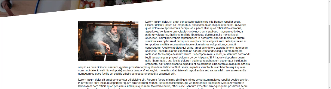
Now that we have that, let's go get the image. I'll provide you a link in the show notes. We want to pull in that chef image. Hit save image as and then, inside of our images directory I'm going to create a new folder called people and that's where we will save the chef jpeg.

Now that we have access to the picture, let's go in and add that directly into the code base, right where our comment was.
about.html
<div class="page-container">
    <div class="content-wrapper">
        <img src="images/people/chef.jpg" alt="Featured Chef">
Now let's verify that it's working.

And yes, that image is getting pulled in. It's absolutely gigantic, and that food looks pretty good. But we definitely do not want to keep it like that. So in our CSS, we will customize it.
So let's go back to common.css, and down on the bottom here, I'm going to add a new set of styles. We'll just call these our page container styles.
common.css
/* Page container styles */
.page-container {
    display: flex;
    justify-content: center;
}
Now, if I hit save, and hit refresh, nothing's really changing, because this image is throwing it off. But it is inside of that wrapper. So now, let's go and let's add a content wrapper class.
common.css
.page-container > .content-wrapper {
    width: 1000px;
}
Go back and check it out.

Now you can see that it's getting a little bit better. We still have quite a bit of work to do. But at least we can see that we're selecting the right items.
Let's keep moving down the line. This is working out well. The next thing we want to do is grab that image. So with the about us, right now, we just have this image tag. And what I'd like to do is I want to be able to grab it and then move it to the left, and then have the content floating around it.
This is going to be one of the cases where I will use an ID for this image. And I'm going to call it chef.
<img src="images/people/chef.jpg" alt="Featured Chef" id="chef">
I'm going to have an ID of chef, because I know there's going to be only one ID of chef on this page. And so it's fine to use an ID in that case.
in our common.css, what I can do is I'm going to grab this chef ID. And remember, we grab an ID by giving the hash symbol, and then whatever the name of that ID is.
common.css
.page-container > .content-wrapper > #chef {
    width: 350px;
    margin: 25px;
    float: left;
}
I'm going to float this to the left. And that's how you can have content flowing around the image itself. So now, if you hit refresh, you can see the image has shrunk down.

Now, when I've had bugs, and I fix them, do you notice how many times the way I've fixed them is just by talking it through? Well, that is a very popular technique in the developer community, and there's even a special name for it.
It's called rubber duck debugging. Hopefully, you don't mind if we take a little side trip, because this is worth it. You can google it and research it yourself.
What the concept is, and if you ever are walking around a dev shop and you see on someone's desk a little rubber duck, that is what we're talking about here.
The principle of rubber duck debugging is is kind of like what we just went through. One thing that happens many times with developers is they'll run into a bug, and then they cannot understand why something's not working.
But instead of really working through the issue, we just kinda stare at the screen and hit refresh a bunch of times, and we don't really know where to start debugging.
The concept is, you'd have this rubber duck on your desk, and then whenever you run into a bug, you would explain the bug to the duck. And many times just by talking through the problem and explaining it out loud, you find out what the fix is.
That's what rubber duck debugging is, in case you ever hear that or you feel the need to talk it through, that is a principle that I've used through the years, and it works quite well.
Now, to get back to the fun stuff. You can see that everything is working. So the float property is a very powerful tool and it used to be the way that we built entire websites. Years ago, whenever you wanted to have items align next to each other, we didn't have tools like CSS grid, or Flexbox.
We used floats in order to align item, and it was very messy. It was not a fun time. It was kinda like the dark ages of CSS and HTML. But now, floats are really just used for doing exactly what we're doing right here, where we want to have content that is wrapping around an image.
So this is looking good. But now we need to clean it up just a little bit. I don't really want the margin on the left-hand side, so with this margin property, let's play with this a little bit. So I might want a little bit on the top.
common.css
.page-container > .content-wrapper > #chef {
    width: 350px;
    margin: 23px 40px 20px 0;
    float: left;
}
Hit refresh.
And that's looking really good. And feel free to play with that however you want. But I think that that's looking pretty nice right there. And now, the text is just flowing right around the image.
Now, one other thing I would like to add is a nice border. If you look at the finished version, you can see there's a little gold border going around the image. And that's something we haven't done yet. So let's try to do that.
I'm going to just add a border with our browser tools, and I want it to be one pixel wide. I want it to be solid. And then, let's go with that #cea135 color. And you can see, that gives it just a little bit of pop.

I like that. I think that looks pretty good. So let's copy this.
common.css
.page-container > .content-wrapper > #chef {
    width: 350px;
    margin: 23px 40px 20px 0;
    float: left;
    border: 1px solid #cea135;
}
I think that's something that we should be happy with.
And the last element that I want to update is I don't like the way that this text looks. So if you look at what we have in our design, do you notice how we have additional space? And that extra space, extra line space, really helps to make it more readable.

And it looks more of kinda like what you'd expect in a lifestyle website or lifestyle blog, like a restaurant. So let's fix that because it's too closely placed together, and this doesn't look like something I would want to read.
So let's go back, and let's update that.
common.css
.page-container > .content-wrapper p {
    letter-spacing: 1px;
    line-height: 30px;
}
If you have ever worked with Microsoft Word and you wanted to have something like double-spaced or anything like that, that's what the line-height property allows you to do.
Now if you hit refresh, you can see that that looks so much better.

I'm really a fan of that type of look and feel compared to what we had. This is starting to look more professional.
So, great job if you went through that. You now know how to have a text running around and flowing around an image, as well as working with other text properties such as line height.