- Read Tutorial
- Watch Guide Video
- Complete the Exercise
We're going to set it up so that we can create a grid, and then from there, we can set up these columns however we want. We can use FlexBox. We could use CSS Grid. The behavior is going to be what we have right here. Where we essentially have one big wrapper div and then we have three columns inside of that.
Let's get started on that. We're not going to worry about the background image or anything like that. My own personal process, whenever I have a feature like that to build, is first to just get the HTML code out there, get a basic structure, and then from that point, I can start actually building in the styles and making it look good.
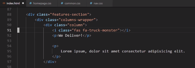
Let's come down, and this is going to be after the hero-section. What I'm going to do is create a new div here. I'm just going to call it the features-section because these are the features for the website. I'm also going to do something that may seem a little bit weird here.
I'm going to explain why I'm going to do it. I'm going to create a columns-wrapper. The features section is kind of going to be like the wrapper for the entire div. So, you can see all the way from left to right and then top to bottom. That's going to be the features section.

Then from there, I want to create a columns wrapper that's going to be about right from here. It's only going to contain the content. Then inside of that, that's where we're going to add each one of these columns.
The reason why I want to do that is because, if you remember, whenever we're working with tools like Grid or FlexBox, all that those tools care about is the immediately nested div element. If we were to only have one wrapper div, we're not going to have as much control over where we want to align these items.
I'm going to right here create another wrapper div, and we'll just call this the columns-wrapper. This is where we're going to put in our content. We'll have one column, and then inside of here, I'm just going to put a little comment and say, icon goes here just so we know about it and we don't forget.

Then let's have a p-tag, and say p for paragraph, and we'll just say We Deliver!. I believe that's what we have if we switch back. Yes. It says, "We Deliver." Then that's in the paragraph tag.
I'm using the paragraph tag because I want to teach you another trick about selectors later on. That's going to be in a paragraph tag and the next one is also going to be in a paragraph tag.
If you ever wonder, if you've ever seen a template site, and you see this Lorem Ipsum text, well that is just Latin, and it's a way that developers are able to implement their own placeholder content.
If you're using a tool like Visual Studio Code, there's actually this really neat little feature. I can say, p> and then here I'll say something like, I believe it is ... Let me see. Is that Lorem? I think it's something like Lorem 8, and if I hit tab ... Yes. That worked.

It's been a while since I've had to do that. I usually use Vim for a lot of my other developments. I don't use the Lorem shortcut, but that worked perfectly. What I did there, and I'll do it again just in case, because it can be a really, really handy little tool.
I gave the name of the tag just like if I did a p-tag and then did a tab just so I would be able to have that P-tag created. So, I said, p and then greater than, and what emmet does is, this is something specific to emmet. If you're using the emmet Plugin with any other development environment, this should also work.
We are saying that inside of the p-tag that I want you to create I want you to put this Lorem Ipsum text. If I did it just like this, this would still work, but it would give me too much content. So, you can see of you just go with Lorem by itself, it gives you all of this content. I don't want that much.
As you can see, if you also, you also have the ability to say how much content you want. So, I can say, p>Lorem and then if I say just 7. That'll give me seven words, just like that. I did 8 because I thought 8 would give me the amount I wanted.

If I hit save there, and oh I'm on the page and it looks like it's all done. We did a great job. It all went by so fast. Anyway, so here we have the first column and we have our demo content. That's working perfectly.

The icon will go there. Now, let's just go, and we're just going to clone this and then once again. Now, let's just add in the additional content. For this one, I believe it said something like, You can code from here and then on the other one, I believe it was like the fry count or something like that. Let's just verify.
You can see that right here we don't have anything else. I'm not sure if I saved it yet. Yeah, it's You can code from here and then 100+ types of fries. Not that this matters. You can put anything you want, but I like to match the design whenever I can.

Hit save and now if we go back to our version we should be able to hit refresh and have all of that content there. Yes, it is ugly, but this is exactly what we need. Technically, we actually have, except for the icons, we have all of the content and all the HTML structure that we're going to need in order to have that section look like this.

That is one of the very amazing things about CSS is that think about how much different this looks compared to what we have here. And the only difference really is just the CSS. That shows how important it is.
We've been going for a few minutes now, but before we take a break I say let's just go and let's go grab those icons. Let's go into Font Awesome, and the reason is just because this way we'll be able to have 100% of our HTML code done.
The very first one is that monster truck for delivering. Let's search for truck. We have a few different types of truck. I like this little monster-truck. I thought he looked pretty cool. You can use anything you'd like though.

I'm going to copy that code here. We've already done this before, but it never hurts to practice it. So, I'm going to get rid of that comment, and paste it in.
Then for this next one, this is a WiFi icon. We'll say, WiFi. There are a few different options. This is kind of the most universal one. I'll click and copy that, paste that in, and then we just have one more.

We have 100, oh, I misspelled that, 100 types of fries. Now the fry one, I believe that was some type of chart. Yes, that is a line graph. Let me see, if we type chart, I believe it comes up. I could cheat and I could just right-click on here and it would tell me, but I feel like that's cheating.
I want to show you the exact process I followed. When I was building this out was I originally created a design and I had some wire frames. Then I created some more high-res designs to have exactly what we have here. So, I want to walk through the exact process that I followed, and that's what I did right here.
We have chart, and that one is here. Yeah, chart-line. If I copy this and now I come down here. We now have that line chart.

If I hit save, then we should now see our icons. Click refresh, and there you go. You have icons right here.

We have all of the HTML structure that we need, and now it's time to start styling it.