- Read Tutorial
- Watch Guide Video
- Complete the Exercise
If you do not know what a parallax feature is, it's our background image, And whenever the user scrolls, you can see how it looks like the image actually stays in the background and looks like the rest of the site is just scrolling on top of it. That is what a parallax feature is.

That's what we're going to build. We have a starter where we have the nav bar and then nothing underneath it. So we're going to add the image into this blank space.
Now you can use any image that you personally want to have, or you can get it from the show notes. I'm going to go to a link and I'll include this link in the show notes as well. Inside of the backgrounds directory, I have a file called fries-hero-bg.jpg.

Go to this link and you can just right click, Save Image as, and then save it into your project. So I'm going to add it to images. I'm not going to put it right here, I'm going to create a new directory and let's call this Backgrounds just so we're organizing all of our code properly.
So we have fries-hero-bg.jpg, and this is what we're going to use for our demo. Once again you can use any image you want. I will say you probably want to have something that is around this size just because this is going to be similar to the actual size on the screen.
Now that we have that image let's add our HTML structure. I'm gonna switch over into the code here and below where that nav bar is and you can see where the closing tags are.

You can see that this is where the navigation wrapper ends. Here I'm going to create a new div.
index.html
<div class="hero-section">
    <div class="top-heading">
        <h1>HTML Styled Fries</h1>
    </div>

    <div class="bottom-heading">
        <h3>Coding fuel.</h3>
    </div>
</div>
Believe it or not, that is all of the HTML code that we are going to have to write. Everything else is going to be set using CSS. So if you hit refresh you can see that we have the content there.

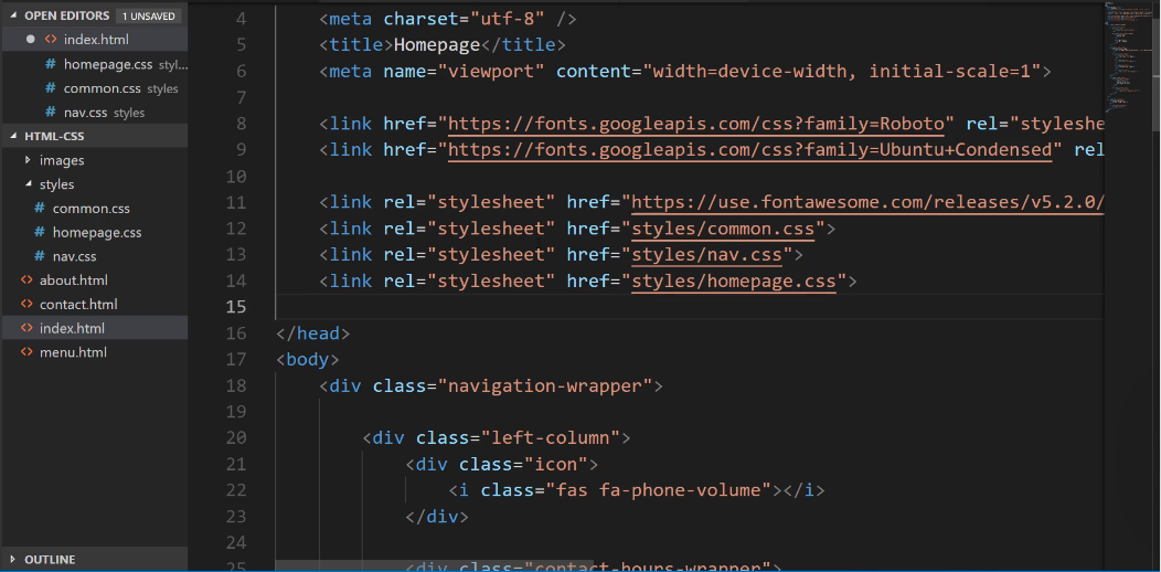
Now we're going to switch over to CSS and we're going to be able to add that parallax feature. So I'm going to create a dedicated file here for homepage styles. So in the styles directory, we'll create a file called homepage.css and then I will make sure to import it here at the very top of the file.
Let's go into homepage.css I'm going to add a comment here and say this is the styles for the hero section. Then let's just grab that class. The first thing we want to do is to grab that image.
homepage.css
/* Hero section styles */
.hero-section {
    background-image: url(../images/backgrounds/fries-hero-bg.jpg);
}
If you're using VS code, VS code kind of cheats for you a little bit. I remember back when I first started coding it was not anywhere near this easy but as you can see it pulls up some set of valid options.
Now that we have that, now we want to add some padding because if you look here you can see that these two headings here are flush up against the left and the top so I want to add a little bit of padding here.
homepage.css
/* Hero section styles */
.hero-section {
    background-image: url(../images/backgrounds/fries-hero-bg.jpg);
    padding: 100px;
}
When I hit save you can see we don't really have what we're looking for, it just gets the top of those fries and that's not exactly ideal.

What I want to do is I want to hard code a height. One other item of note, the only reason why we even have this height already is because we have the padding and these headings, so it's simply going off of the content. That's not what we want. We actually want to dictate the height.
I'm going to add a height value here.
homepage.css
/* Hero section styles */
.hero-section {
    background-image: url(../images/backgrounds/fries-hero-bg.jpg);
    padding: 100px;
    height: 300px;
}
So now that we have that let's actually build the parallax feature.
homepage.css
/* Hero section styles */
.hero-section {
    background-image: url(../images/backgrounds/fries-hero-bg.jpg);
    padding: 100px;
    height: 300px;
    background-attachment: fixed;
    background-position: center;
    background-repeat: no-repeat;
    background-size: cover;
}
We'll walk through what each one of these represents as well, but for now, hit refresh, you can see that our image is centered.

Now it's kind of hard to tell that the parallax feature is working because we don't actually have any scrolling. So let me pop this open here really quick in a new browser window where we have a little bit more control over the size.
So let's shrink this down just a little bit. There you go. OK. So now watch what happens. Do you see how the image there is now held in place even when we're scrolling?

So that is the full parallax feature. This is all working really nicely and that's all of the code that you needed to implement to build a parallax.
Now let's switch back and walk through exactly what this is doing. We've talked about background image. I think that's kind of self-explanatory, that's just grabbing a path to the URL. Then we added some padding for the content and then we declared a hard-coded value for the height.
Now the background-attachment. What this is saying is that we want the image to be fixed. We do not want it to slide up and down the way, an image normally would. Now the background position, this takes the image and it just centers it, so we could position it however we want.
I want the majority of the middle of the image to be shown, so I had it centered and then by default images actually repeat. So a background image if you just want it to be shown one time you have no repeat.
Now, if you had someone who has a widescreen monitor, and you didn't set it to no repeat, They would actually see multiple versions of the image.
Lastly, we have this really cool little feature called background-size: cover;. What this does is this will take the image and it shrinks it down and also crops it so that it's able to be shown as we see in our browser.
That is something that is really cool. I use the background cover quite a bit because what it does is it maintains the aspect ratio but it crops the image. So it is centered and so it's just grabbing the very middle of the content and it's doing kind of like a digital crop of that image.
Now if you're working with an image and it performs the wrong type of crop then you may need to edit the image itself or something like that. But for most cases, I've found that that works quite nicely. So in review you now know how to implement a full parallax feature in HTML and CSS.