- Read Tutorial
- Watch Guide Video
- Complete the Exercise
I know that we've spent a lot of time in building out this nav bar but that's because as you may have seen, we're learning a lot of the HTML and CSS fundamentals in order to do this, and you're building a professional looking page element. After you have these fundamentals down, then you can simply populate that down throughout the rest of the site.
So most of the time these kinds of things don't take this long but if you're learning from scratch, then it's important to not only build it, it'd be very quick and easy for you to just follow along and copy and paste the code that I write but it's more important that you actually understand the underlying concepts.
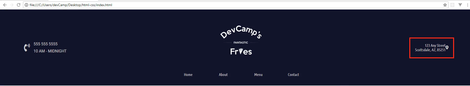
So with all that being said, let's build out this right column set of styles. If you look at the finish design and what we want to have, you'll see that we have this address on two lines and then we have this little icon bar here that's for the map, and you may have also noticed, this has a nice little hover effect, both of these do and they look a lot like what we already implemented here in the navigation bar.

So we're gonna be able to use some of those same styles. So let's switch back now to the code and let's see what kind of structure we have. So we have this right column and then we have the address wrapper and then we have this little icon here.
Now we want to reverse what we did on the left hand column, so I'm going to take this icon and move it down a couple lines below and let's create another div. So here I'm gonna call this the contact icon and then let's move the closing div tag right here, and so now what we have is our address wrapper and then a separate div for the contact icon.
index.html
<div class="right-column">
    <div class="address-wrapper">
        123 Any Street
        Scottsdale, AZ, 85251
    </div>

    <div class="contact-icon">
        <i class="fas fa-map-marker-alt"></i>
    </div>
</div>
So as you may have guessed, we have a couple different options, we can use Flexbox or we can use CSS grid to align these, and you could use either option. I personally think I'm going to go with Flexbox for this one. So we want to select the right column styles right here, so let's make sure, let me see if we've already done anything for the right column, I don't believe that we have.
So we do have some right column styles. I personally like to keep these organized, so I don't like to have things like the right column out in spots where it's gonna be harder to find or might get lost, so I'm going to cut this and come down, and this is a really good spot to have some comments here. So right above this I'm gonna add a comment and I'll say, right column styles, and where our center column is, let's add something for that.
So let's go up top to where we have the start of the center column, and I'm just going to say, center column styles and then up top where we start with the left, now we're going to have our left column styles. This just makes it a lot easier so that as we are navigating through if we ever want to make a change, we will know right where all of the left column styles are, where all the center ones and then where all the right ones are.
So that is the reason why I like to do that. The one thing you'll notice, the larger the application, the more cognizant you have to be with how you organize your code. There's entire fields of study based on how important it is to organize code because a messy code base is one that you're not gonna want to spend a lot of time with, and it's gonna be hard to maintain. So it's always best if you start with using your best practices right from the beginning.
So I'm gonna give a navigation wrapper selector and then grab the right column here and then inside of here, as you may have guessed, we want to display Flex and then I just want to use, align items and say center, and I believe that's all we're going to need here.
styles.css
/* Right column styles */
.navigation-wrapper > .right-column {
    display: flex;
    align-items: center;
}

.navigation-wrapper > .right-column > .address-wrapper {
    font-family: 'Ubuntu Condensed', sans-serif;
}
So if I switch back and hit refresh, you can see that, that has been moved over but we still have a little bit of work to do on how these are gonna be separated.

So first and foremost, we want to have a line break right here. Now we had a line break over on this left hand side however, on the right hand side we want to have one that is actually for the same type of content. So here we have a phone number and we have the hours. It makes sense for those to separate divs, but here this is really all the same thing, this is just an address. And so we have another really helpful tool here called the BR tag and this gives us a line break.
So if I come here to where it says, any street and I say BR and pass in this tag, if I come back and hit refresh, you'll see that, that is now on two lines and we didn't have to do any other CSS whatsoever.
index.html
<div class="right-column">
    <div class="address-wrapper">
        123 Any Street<br>
        Scottsdale, AZ, 85251
    </div>

    <div class="contact-icon">
        <i class="fas fa-map-marker-alt"></i>
    </div>
</div>

So that just gives us a nice little line break. So we also need to have this address wrapper styled a little bit differently. So right now we have the font family there, but let's also align the text. So I'm gonna say, text align to the right. Before this, we'd only seen text align to the center but if we say to the right, this should give us what we need and there you go. Now you can see the address is lined up to the right hand side.
style.css
/* Right column styles */
.navigation-wrapper > .right-column {
    display: flex;
    align-items: center;
}

.navigation-wrapper > .right-column > .address-wrapper {
    font-family: 'Ubuntu Condensed', sans-serif;
    text-align: right;
}
And then we also have the issue where this is supposed to be a link, actually the icon and the address are both supposed to be links. So let's go to our code here, and let's convert all of this into a link. So there is a little bit of a tricky way to do this because we have this all on one line but actually the BR tag can fit right inside.
So I'm going to give an, a tag and then an href and here we want this pointed to the contact HTML document and then at the very end, we're just going to close off that, a tag.
index.html
<div class="right-column">
    <div class="address-wrapper">
        <a href="contact.html">123 Any Street<br>
        Scottsdale, AZ, 85251</a>
    </div>

    <div class="contact-icon">
        <i class="fas fa-map-marker-alt"></i>
    </div>
</div>
So now if you hit refresh, this is actually a link.

So if I click on the link, you can see it goes to the contact page.

So that is working well. We obviously need to style this better but at least that is a link and now we're gonna do the same thing here for our icon.
So these icons really can be treated like any other HTML code, which means we can wrap them up in a link as well. So I'm going to say, a and then href, same thing, contact HTML and whenever I have a lot of code, just like we have right here, and really like we have here, I usually like to wrap it up and then indent it.
index.html
<div class="right-column">
    <div class="address-wrapper">
        <a href="contact.html">123 Any Street<br>
        Scottsdale, AZ, 85251</a>
    </div>

    <div class="contact-icon">
        <a href="contact.html">
            <i class="fas fa-map-marker-alt"></i>
        </a>
    </div>
</div>
It just is a little easier to read and thankfully white space in HTML is something that's completely ignored, and when I mean white space I mean that you can break this up into different lines and HTML will not render it as a different line. So this just allows to organize our code in a way that's a little bit easier to read.
So now you can see if you click on that little icon we're taken to the contact page. So everything's working well but we still need to work on some of our animations and also our styles. So we have this contact icon, I think it's probably time to style this up a little bit.
So let's come down here and let's add a selector, so I'm gonna have my navigation wrapper, I want a right column and then what was the name of that class, one more time, it was the contact icon class, contact icon and here I'm gonna set the font size and I'm also gonna set some margin to the left.
So I'll say margin left here, and let's go with 15 pixels and then I want to do a font size of 2em, which remember that will give me double the size of the font.
styles.css
/* Right column styles */
.navigation-wrapper > .right-column {
    display: flex;
    align-items: center;
}

.navigation-wrapper > .right-column > .address-wrapper {
    font-family: 'Ubuntu Condensed', sans-serif;
    text-align: right;
}

.navigation-wrapper > .right-column > .contact-icon {
    margin-left: 15px;
    font-size: 2em;
}
Hit refresh and there you go, our icon is looking much better, looks a lot more like what we have over here.

So now the last few items we have to do just revolve around styles and then some of those hover effects. So let's look at the final version. You can see that we want to have a start state here where this link, where this address, starts with kind of this darker gray and the icon starts with that off white but they both switch to that yellowish, gold-ish type color.
So let's start with the, I think with the address. We'll go with that one first just so we can move from left to right, and your first inclination may be to simply add the content inside of this address wrapper but actually what we need to do is to get a little bit more specific, we need to add it to the, a tag.
So I'm going to copy this, and then at the very end just add a, a tag. We can get rid of the font family and the text align. Those are fine in the wrapper class but now what we need to do is add the styles that are specific just to the link.
So a few of those are going to be things like the color, and so we want to have that dark gray which the hexadecimal value for that is gonna be #858585 and then let's go with text decoration of none, and then from there we want to have a font size that is a little bit smaller. So I want to have a font size of 0.9em which is just around 90% or so, and then for animation purposes, which is really just gonna be a nice hover effect where we change the color, then I want to do a transition of 0.5s, so just half a second.
styles.css
/* Right column styles */
.navigation-wrapper > .right-column {
    display: flex;
    align-items: center;
}

.navigation-wrapper > .right-column > .address-wrapper {
    font-family: 'Ubuntu Condensed', sans-serif;
    text-align: right;
}

.navigation-wrapper > .right-column > .address-wrapper a {
    color: #858585;
    text-decoration: none;
    font-size: 0.9em;
    transition: 0.5s;
}
So if I hit refresh now, you can see that, that is working and that color looks a lot better.

So now what we want to do is let's add our hover effect. So I'm going to just copy that and then I'm gonna add a sudo selector here at the very end. So instead of just A it's gonna be, a:hover and then we're gonna remove each one of those items because all we really need here is going to be the color, and for that we'll reuse that #cea135.
styles.css
.navigation-wrapper > .right-column > .address-wrapper a:hover {
    color: #cea135;
}
Now if I come back and hit refresh, come over and hover, you can see we have that nice fade in and fade out on the link and the link is still functional, so that's working perfectly.
So now let's switch back and let's just add the styles to the card icon and we're gonna be all done. So here we'll get rid of the values inside. First we're just gonna grab the, a tag and then we'll change the color. So the color that we're gonna want is kind of that off white color, which is that #cbcbcb color and then for the hover effect, we're just going to switch it up, add that hover element and now we'll go with that same #cea135.
styles.css
.navigation-wrapper > .right-column > .contact-icon a {
    color: #cbcbcb;
}

.navigation-wrapper > .right-column > .contact-icon a:hover {
    color: #cea135;
}
Hit save, hit refresh and now you can see the start of the color change, just like we have our nice icon for the phone over here and now I hover over this, it works, I hover over that and it's working perfectly.
So as you may have noticed, this transition doesn't work and it's probably because I forgot to put a transition in here. So if you ever have some type of hover effect that doesn't work, always make sure that you have your transition. So I'm gonna say half a second on that transition.
.navigation-wrapper > .right-column > .contact-icon a {
    color: #cbcbcb;
    transition: 0.5s;
}
Hit refresh and there we go, now we have that nice little fade in and fade out. When it comes to animations you typically don't want to overdo it, you don't want to go over the top and have things flying all over the page, it's better to just kind of have nice little subtle types of animation that will give the site a more professional look and feel, while also giving some nice dynamic behavior.