- Read Tutorial
- Watch Guide Video
Our site is coming along good, and in this video, we're going to customize the content headings. In a responsive website, it's important to have the content headings displayed in different formats, so it can be customized to fit different screen sizes.

If you see, the categories listed on the right hand side are exactly the same values in the dropdown box. We'll use CSS to style them for different screen sizes.
That said, we'll continue building our content. Below the <select> box, I'm going to paste a set of code, and we'll go through it line by line.
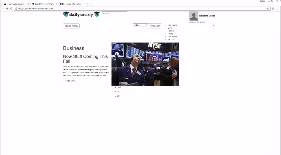
<div class="clearfix"></div>

<div class="horizontal clearfix">
  <div class="col-xs-5 text">
    <h1>Business</h1>
    <h2>New Stuff Coming This Fall</h2>

    <p>Duis aute irure dolor in reprehenderit in
                            voluptate velit esse cillum <strong>dolore eu fugiat
                            nulla</strong> pariatur sunt in culpa qui officia
                            deserunt mollit anim id est laborum.
                            Duis aute irure dolor in reprehenderit...</p>

    <a href="article.html" class="btn btn-default btn-dotted pull-left"><span>Read More</span></a>
</div>
<div class="col-xs-7 image">
  <img src="images/image1.png" />
  <ul class="stats">
    <li>
      <span class="icon icon-view"></span>
      <p>369</p>
    </li>
    <li>
       <span class="icon icon-comment"></span>
       <p>36</p>
    </li>
    <li>
       <span class="icon icon-relations"></span>
       <p>52</p>
    </li>
    </ul>
    <div class="featured"></div>
  </div>
</div>
We're starting off with two <div> sections, the first one has the clearfix class as we're going to start off in a new line. Though we're nested within the same row class, we're on a different line, and this is why we're using this class. In the next <div> tag, we're again calling clearfix class and another custom one called horizontal. Inside this, we have another nested <div> that'll use the five columns of the bootstrap grid. These five columns will contain text, while the remaining seven columns will be for an image related to that text.
The text has some styles, and there's also a link with styling that we've seen before. The image also has some classes that are both custom and built-in. An interesting thing is, there's an unordered list on top of the image, and this is not something you'll see often. Though it looks crude on the webpage now, it'll eventually fall in place once we define the styles.
Before going further, I want to quickly talk about the grid system. There are 12 columns that'll run from the left-most part of the page to the right-most. Inside this grid, you can have many nested grids. If you look at our output, you'll see that the text and image are a part of the nested grid.
This is important to understand, especially if you're wondering why a 12-column grid is not spanning the entire page. Also, if you look at the code, this text-image grid of 12 columns is nested inside a grid that takes nine columns, so the remaining three will be for listing out the categories.
Hope that's all clear now.
Moving on, I'll paste another block of content. If you're following along, you can either type out the content or simply copy it from the github repository.
<div class="vertical">
  <div class="image">
    <img src="images/image2.png" />
    <ul class="stats">
      <li>
         <span class="icon icon-view"></span>
         <p>369</p>
      </li>
      <li>
         <span class="icon icon-comment"></span>
         <p>36</p>
      </li>
      <li>
         <span class="icon icon-relations"></span>
         <p>52</p>
       </li>
     </ul>
     <div class="featured"></div>
</div>
<div class="text">
    <h2>New Stuff Coming This Fall</h2>
    <p>Duis aute irure dolor in reprehenderit in
                                voluptate velit esse cillum <strong>dolore eu fugiat</strong>
                            nulla pariatur sunt in culpa qui officia
                            deserunt mollit anim id est laborum.
                            Duis aute irure dolor in reprehenderit...</p>
    <a href="article.html" class="btn btn-default btn-dotted pull-left"><span>Read More</span></a>
  </div>
</div>
This section begins with a <div> tag with "vertical" class. It has an image and some stats that'll sit on top of the image once we integrate our custom style classes. Lastly, it has some text, but it'll be located on the right hand side.
If you refresh the page, this is what you'll see.

If you see, the look and feel of this block is different from the previous one. Here, the text goes all the way to the right, but will change once we define our styles.
Moving on, we'll have another "vertical" class, which is a custom style. Along with this custom class, there are two others. There'll be an image and some text inside this <div> too.
<div class="vertical padding featured">
  <div class="image">
    <img src="images/image3.png" />
    <ul class="stats">
      <li>
        <span class="icon icon-view"></span>
        <p>369</p>
      </li>
      <li>
        <span class="icon icon-comment"></span>
        <p>36</p>
      </li>
      <li>
        <span class="icon icon-relations"></span>
        <p>52</p>
      </li>
    </ul>
    <div class="featured"></div>
</div>
<div class="text">
    <h2>New Stuff Coming This Fall</h2>
    <p>Duis aute irure dolor in reprehenderit in
                            voluptate velit esse cillum dolore eu fugiat
                            nulla pariatur sunt in culpa <strong>qui officia
                            deserunt</strong> mollit anim id est laborum.
                            Duis aute irure dolor in reprehenderit...</p>
     <a href="article.html" class="btn btn-default btn-dotted pull-left"><span>Read More</span></a>
  </div>
</div>
If you come all the way down, you'll see some different classes for our button, and this is just to give it a different style.
The output looks like this now:

This section and the previous one are fairly similar, as the styles are almost identical.
The last part in this video is going to be a horizontal class.
<div class="horizontal clearfix">
  <div class="col-xs-5 text">
    <h2 style="margin-top:0px;">New Stuff Coming This Fall</h2>

    <p>Duis aute irure dolor in reprehenderit in
                            voluptate velit esse cillum <strong>dolore eu fugiat
                            nulla</strong> pariatur sunt in culpa qui officia
                            deserunt mollit anim id est laborum.
                            Duis aute irure dolor in reprehenderit...</p>

    <a href="article.html" class="btn btn-default btn-dotted pull-left"><span>Read More</span></a>
</div>
<div class="col-xs-7 image">
    <img src="images/image4.png" />
    <ul class="stats">
      <li>
        <span class="icon icon-view"></span>
        <p>369</p>
      </li>
      <li>
        <span class="icon icon-comment"></span>
        <p>36</p>
      </li>
      <li>
        <span class="icon icon-relations"></span>
        <p>52</p>
      </li>
    </ul>
    <div class="featured"></div>
  </div>
</div>
Remember to nest it inside the right container if your copy-pasting the code.
If you see the webpage now, it'll have a different look and feel.

We'll continue adding content in the next video.