- Read Tutorial
- Watch Guide Video
Now that our content is in place, let's start styling the elements. As always, the first step is to create a stylesheet and link it to our HTML file. We'll test it out by having a black background for the entire page, so we know our link is working.
That's all working fine, so we can remove this tag.
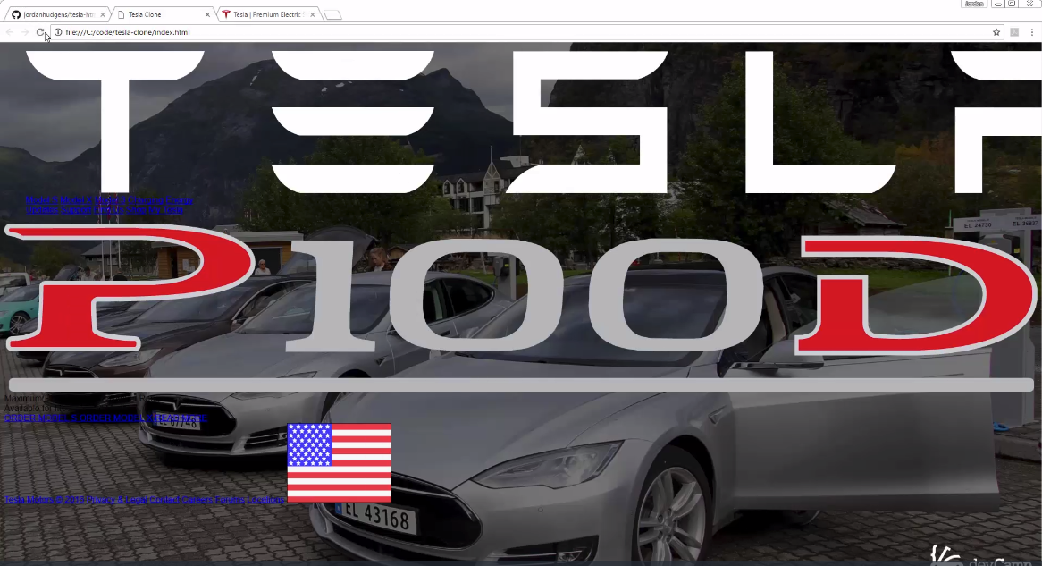
To start off, I'm going to give a style for the entire <html> tag, not just the <body>. This is where we'll set our background image. For this image, we want it to be centered both on the vertical and horizontal axis, we don't want it to be repeated and we want it fixed.
In the future, if you ever need to set an image for the entire website, this is the way to do it.
Next, to maintain the aspect ratio, we'll set the background-size to "cover". You'll have to do this separately for all browsers though.
Lastly, we'll set a single font family, namely, sans-serif, for the entire application.
html {
  background: url('img/teslas.jpg') no-repeat center center fixed;
  -webkit-background-size: cover;
  -moz-background-size: cover;
  -o-background-size: cover;
  background-size: cover;
  font-family: sans-serif;
}
If you open it in the browser, you'll see that the image has taken up the entire web page, and this is good.
Moving on, we'll work on our #container style, which will be essentially for all the elements. Here, I want the entire content to be centered, so I'm setting a value of "auto" to the margin. We'll also hard-code width to 1300px. Let's not worry too much about responsiveness for now, rather we'll focus on the design only. In fact, the actual Tesla homepage itself is not too responsive, so we'll probably let it be as it is.
Next, we'll reduce the size of the logo image to 150px. Also, we want it to float to the left, and the position should be absolute.
#container {
  margin: auto;
  width: 1300px;
}

#logo img {
  width: 150px;
  float: left;
  position: absolute;
}
The output looks a lot better now.

The next thing we're going to work on is the left navigation bar. We want this to float to the left as well, and we'll set a left margin too.
Likewise, we'll style the right navigation bar. We obviously don't want any float, but we need a big left margin. If you're wondering why we're hardcoding specific values, it's because we are working for a specific-width website. In the future guides, we'll talk about customization and responsiveness.
For now, the code is:
#left-nav-buttons {
  float: left;
  margin-left: 205px;
}

#right-nav-buttons {
  margin-left: 805px;
}
If you look at the output, you'll see that the navigation bars are lining up nicely.

Finally, we'll style our links. We want this to be white without any kind of text decoration. Also, I think a small margin on the left would give some space between each link.
.nav-button {
  color: white;
  text-decoration: none;
  margin-left: 25px;
}
If you refresh the browser, it looks a lot cleaner.
