- Read Tutorial
- Watch Guide Video
Okay, so what we want to do is we want to look at the margin between these, we've got about 38 pixels there and we've got about 59 pixels there. Okay, now let's go ahead and look at the design here and just see where this belongs everywhere throughout our app. Because if it's going to be about the same everywhere we might as well just throw in the styles there.
So it looks like this page title is going to have a margin of 38 pixels on every one of these for padding. So let's go ahead and let's go into our page-title.scss and let's just say margin-top is 38 pixels.
page-title.scss
.page-title {
    color: #666;
    font-family: 'Titillium Web';
    font-size: 30px;
    font-weight: 600;

    margin-top: 38px;
}
All right now let's go back to our application in the browser, and you'll see it pushes it down a bit.

Okay, now the bottom here is going to need about however many pixels as well, so 59 pixels. So let's say margin-top is 38 and then merging bottom is 59px.
page-title.scss
.page-title {
    color: #666;
    font-family: 'Titillium Web';
    font-size: 30px;
    font-weight: 600;

    margin-top: 38px;
    margin-bottom: 59px
}
So I just added in those two margins and now we have this, and yeah that looks great.

It looks like our design. Okay, now you might notice that the text is a little bit off, I'll show you how we can fix that later on. But I just wanted to mention that now because you probably noticed it.
So let's go ahead and let's check our design here, we need to basically apply a little bit of the gap right here in between the email form and the password, about 14.5px, and this big gap here under the password. Okay so let's define the grid in our form.
If you remember correctly we didn't put the page title in our form, if you go into signinForm.js. Page title is not in here because it's in signin.js, so just know that that's not in there. Now let's go into our signin.scss and let's put that in here, let's say and page title just so we have it. We're probably not going to do anything with it though and if you really want you can be extra clean and you can move the margin-top and bottom to the signin right here in &__page-title. Although since it's going to be the same throughout the app we're not going to do that.
Now if this was a bigger application we might use that exact title somewhere else without margin but so far it's not going to do that, if we need to change it we will. So what I want to do is in the form here let's just say display is grid and let's say grid template rows, and let's think about this okay. In our form we've got the e-mail the password and login and the line, so we've got four things okay.
So we've got that e-mail start and we've got the e-mail end and we've got the password start and we've got the password end then we've got the line start and we've got the line end we've got the login start and the login end.
Now what I'm going to do is I'm just going to basically go into the design and see how high these should be. Now it probably doesn't matter because we've already specified the gap and everything so let's not do that yet but it's going to be about 64 pixels if we need it, okay so this is going to be 64 pixels high.
Okay, this gap is going to basically take up the remaining space, so we're going to want to put this as 1fr this big gap. So we can put that on the line and then make the border on the line be at the bottom, if that makes sense. We could also just put in another 1fr in-between the password and the line.
So we could say bam bam and then we could put 1fr here and then the line is going to be about one pixel or something like that, right, let's say two pixels.
signin.scss
&__form {
    dislplay: grid;
    grid-template-rows: [email-s] [email-e password-s] [password-end] 1fr [line-s] 2px [line-e login-s] [login-e];
}
Now the problem with doing this, is when we align everything on the grid we can't say 1fr because they'll all kind of be the same size, that gap needs to be bigger. Okay, let's go ahead and put in for the e-mail 64 pixels and the password 64 pixels. And how ever high the button is, so let's go to formFields.scss and look at how high that is, it's 38 pixels. So you can say that the button is 38 pixels for the login.
Now by using rows this is going to be really easy to make mobile responsive because this is all we'll have to change is the rows with a media query, and then it will automatically apply to what's been named here already, so that's a really good advantage of naming things. Because in a media query we might have email for whatever reason all the way down here at the end right, and it's automatically going to apply. But if we didn't and we used numbers then it would automatically be bound to the first row, if we used one.
Okay, so let's go align these we've got line, and we've got email, password, and then at the bottom here we got login. Okay, so let's go aline these now, let's say this let's say grid row is email start to email end. Then I'm just going to copy this into all of these, and then I'm going to change them accordingly.
Password command + d after I select all that, line, select all of e-mail command + d select login or type login.
signin.scss
.sign-in-form {
    &__email{
        grid-row: email-s/email-e;
    }
    &__password {
        grid-row: password-s/password-e;
    }
    &__line {
        grid-row: line-s/line-e;
        border-top: 1px solid #ccc;
    }
    &__login {
        grid-row: login-s/login-e;
    }
}
Okay, that's going to be good for now. We might need to define a column, let's go check it out. Okay, it looks good to me, although you'll see that there is this big space here.

Now the reason that 1fr isn't filling up any space is because we never defined a height for this form. So it's saying, "Okay, it's only as high as what's in it". So it's going to be worth nothing because there's nothing even there. So what we need to do is on the form we just need to say height is 100 view height and then we're going to change this because that's not going to be accurate, it's going to be too high. You'll see how big that is.

Now the reason I knew that automatically was going to be to high is because we're making the form 100 view height and the form starts right here at login, it doesn't start at the top of the view height. If it started up here then it would be a perfect size. Okay so we need to do is get rid of that and we instead need to make signin 100 view height.
signin.scss
.sign-in {
    height: 100vh;
    grid-row: content-s/content-e;
    grid-column: s/e;
}
Now if this doesn't work, we can mess around with it until it worked, it wouldn't be too hard, but it's just not worth doing it this way. A better approach is just to put in the exact height from here to here, right, so about 289 pixels. Okay so instead of saying 1fr let's just say MinMax 20 pixels and then 289 pixels.
signin.scss
&__form {
    dislplay: grid;
    grid-template-rows: [email-s] [email-e password-s] [password-end] minmax(20px, 289px) [line-s] 2px [line-e login-s] [login-e];
}
Now let's get rid of this height in .sign-in and let's see what happens. Okay we'll see that looks good.

Now since we used MinMax it might, I guess not, but in the future when we make some adjustments this will minimize to 20 pixels which is nice. Like if we were to actually apply it to the grid we haven't done that yet because we didn't define it on the signin.
Okay, now let's apply a margin to our button because you'll see that in here it's got about 39 pixels.
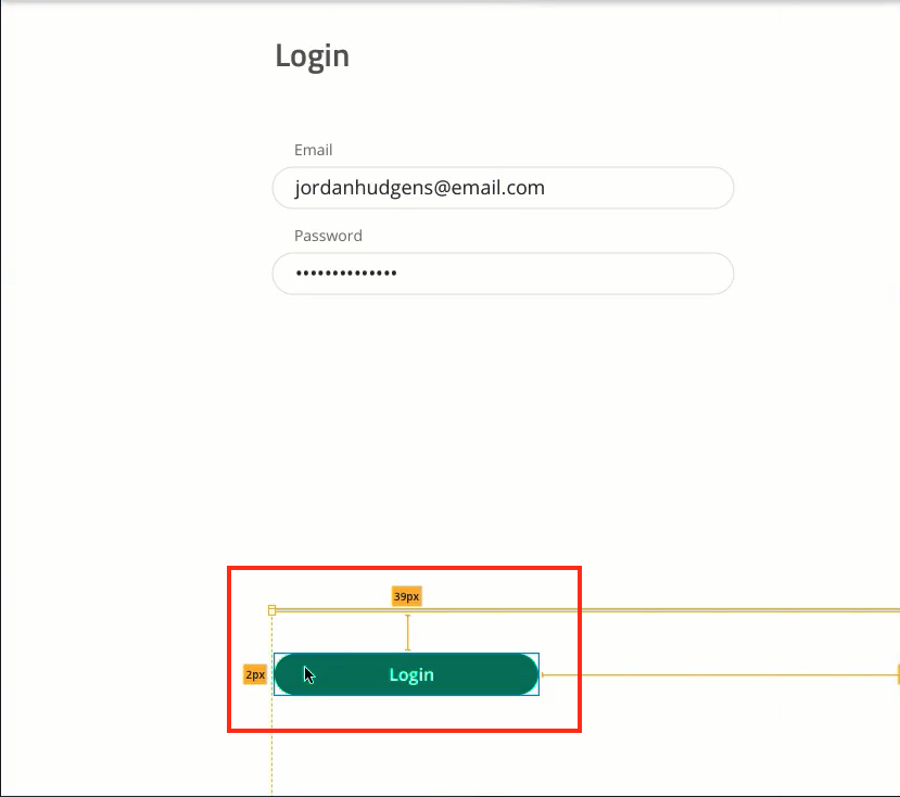
So let's just add that to the line, let's say on the line at the margin-bottom 39 pixels.
signin.scss
&__line {
    grid-row: line-s/line-e;
    border-top: 1px solid #ccc;
    margin-bottom: 39px;
}
Now you could also even apply a space here somewhere right like after the line you could just say something like 39 pixels or something right, I don't want to do that, feel free to do that if you want. There's no correct way of doing it, there's just ways that work and ways that don't.
Okay so it looks like it didn't work entirely, let's try padding. Okay, it looks like it didn't work. Let's inspect the element and see what's going on here. All right so what I want to do is, let's try applying it to the login. Now if this doesn't work we'll just throw it into the row. Now, this approach would have worked if we had defined a height for signin but we didn't, so thats probably why it didn't work.
So that works, so putting a margin top on the login button and notice I didn't put it on the login button in formFields.scss, I put it on the button in signing form. That's why we pass in class names the way we're doing it right, see in signinForm how we pass in a class name. That's why we're doing that because then we can apply styles to that button specifically and not every button.
Whereas with the style tag that's already in there we can apply some global styles that will apply to every button. So let's go back to Chrome and that looks really good.

Now let's put in some space in between the email and password, okay it's about 14.5 pixels, I'm just going to round that to 15 pixels. So let's say password and we'll say margin top is 15 pixels.
signin.scss
.sign-in-form {
    &__email{
        grid-row: email-s/email-e;
    }
    &__password {
        margin-top: 15px;
        grid-row: password-s/password-e;
    }
}
Okay, that looks good to me, it looks like our design. So all we need to do now to get the rest of these styles in is we need to basically add in the quick links and fix the text, you might not notice it, but there's a slight difference between the text. It's like a little foggy on our screen and we want to change that.
So in the next video will handle that and the quick links. So let's commit our code.
Terminal
git status
git add .
git commit -m "styled sign in form and applied grid"
Great job, I'll see you in the next video.