- Read Tutorial
- Watch Guide Video
You'll see that we have email. We want to do that one. I'm going to copy this, and paste it in. We'll go over it a bit. This is for part of the input. There are about three things we're going to need to copy over from there.

Let's create a new file on our style folder, called form-fields.scss. Let's proceed to our main.scss and import this. Let's say:
main.scss
@import 'page-title';
@import 'form-fields';
Now, let's head back to form-fields.scss, and let's say:
form-fields.scss
.form-input {

}

.form-button {

}
Those are the two we have right now. Let's head to formFields.js, and I'll show you what I'm talking about. We form-input and form-button. Now, within these, we have a label, an input, and then a button in this one. We can remember that.

Let's head back to form-fields.scss. I almost forgot we got the label and we got the input. Now, in form-button, we obviously have the button. That's our structure for our CSS.
form-fields.scss
.form-input {
    &__label {

    }
    &__input {

    }
}

.form-button {
    &__button {

    }
}
I copied some styles from Invision. I'm going to paste those into input here. So I just pasted in these 5 lines. Go ahead and look at this, and get this copied in. We'll talk about it a bit.
form-fields.scss
.form-input {

    &__label {

    }
    &__input {
        box-sizing: border-box;
        height: 39px;
        width: 426px;
        border: 1px solid #E6E6E6;
        border-radius: 20px;
    }
}
We have a height of 39px, we've got a width of 426px, a box-sizing of border-box, and a border of 1px solid #E6E6E6. That all looks good. Let's go ahead and look in our application and see what we got. It should look very similar to that. We got that in there, and it's really nice.

The next thing I want to do is get in the styles for the actual text in there. You'll see that in here the text is bigger. You want to click on that, I'm going to copy this code from Invision, I'm going to paste it into the label, and then I'm going to get rid of this className that I pasted in, so we have these lines right here.
form-fields.scss
.form-input {

    &__label {
        height: 24px;
        width: 231px;
        color: #333333;
        font-family: "Open Sans";
        font-size: 14px;
        line-height: 24px;
    }
    &__input {
        box-sizing: border-box;
        height: 39px;
        width: 426px;
        border: 1px solid #E6E6E6;
        border-radius: 20px;
    }
}
Now, one thing I want to point out is that most of the text throughout this application is going to have a font-family of Open Sans. Let's go back to the design, get these 6 lines in, and we're going to delete a few of these.
Let's go over to Chrome here and you'll see that if you click on email, we have Open Sans right? If we click over here we have Open Sans. We click here, and they are all the same. A few of them are going to be different throughout the app, like this one for example, but most of them are going to be Open Sans.

What we need to do is copy this and put it somewhere that it's going to apply it to everything. I'm going to first get rid of that width, height, and line-height. Now, we have these three lines.
form-fields.scss
.form-input {
    &__label {
        color: #333333;
        font-family: "Open Sans";
        font-size: 14px;
    }
    &__input {
        box-sizing: border-box;
        height: 39px;
        width: 426px;
        border: 1px solid #E6E6E6;
        border-radius: 20px;
    }
}
The next thing I want to do is get this font-family and cut it out. You'll see we are left with two lines. You'll see that by copying these over, there's a lot that we can cut out because we don't need a lot of these, like the width and height.
Now, for the input that's a different story because we obviously want this to be a fixed width and height. The point I'm trying to make here is: I'm not copying things over. We're having to think about this. When you're using Invision on your own projects it's not just going to be copy and paste.
Although, it's really nice that it generates a lot of these for you because you can just filter out what you don't need. Generally, it will contain what you do need, and a lot that you don't. I'm going to save that. Remember that we have Open Sans on the clipboard.
Let's go back to main.scss, and what I want to do is type out a body tag and just paste that in there.
main.scss
body {
    font-family: "Open Sans";
}
Now, we have Open Sans, and it's be applied to everything in our body by default. Let's head over to Chrome, and let's go to our app. You'll see now that login, e-mail, and password all have this.

Now let's just go ahead and get rid of it real quick. One thing I want to mention is back in our design, we're trying to get these styles in, but I accidentally put it in for e-mail and password. We need to move the color and font-size and put it in input because technically, it's still part of the input.
form-fields.scss
.form-input {
    &__label {

    }
    &__input {
        box-sizing: border-box;
        height: 39px;
        width: 426px;
        border: 1px solid #E6E6E6;
        border-radius: 20px;
        color: #333333;
        font-size: 18px;
    }
}
You'll see now that these look good. You will also notice that password and e-mail are still not in Open Sans. We can test this out by inspecting it. Then let's pull this up and you'll see font-family: open Sans. Let's get rid of that. You'll see that it changes e-mail and password.

Basically, we haven't applied any styles to that label, but it's still inherenting this. Let's go get the styles for the label now. Let's go into the code here and I'm going to copy this e-mail's styles. I'm going to paste it into label.
Let's get rid of the width and height. We don't need the font-family obviously. We don't need line-height. Here's another thing I want to point out, we only have two properties here. That's nice, but this color's is going to be applied most often throughout our text.
form-fields.scss
.form-input {
    &__label {
        font-size: 14px;
        color: #808080;
    }
    &__input {
        box-sizing: border-box;
        height: 39px;
        width: 426px;
        border: 1px solid #E6E6E6;
        border-radius: 20px;
        color: #333333;
        font-size: 18px;
    }
}
Obviously, a lot of these are going to be different, but that's why you we will overwrite them when we get to them. What I want to do is move this color to where we moved the font. Let's go into main.scss, and let's say:
body {
    font-family: "Open Sans";
    color: #808080;
}
Let's go check our application. All we did was change the font-size to 14px and move the color #808080 to the body.

The next thing I want to do is apply some styles to the log in button, and then we'll take care of all the grids for these. I'm just going to go to log in here, I'm going to copy this, and I'm going to go into button here and paste it in. I'm going to get rid of these, so I just copied these four lines in.
form-fields.scss
.form-button {
    &__button {
        height: 38px;
        width: 243px;
        border-radius: 20px;
        background-color: #00CB79;
    }
}
Get those down. You got to height of 38px, a width of 243px, border-radius of 20px, and then a background-color of #00CB79. That should be good. Let's go try it out in the browser. The text is going to be different, so just remember that. See we got the text? It's black. We have the button now though. It looks nice.

Let's get rid of this focus and then let's put it in these colors for the text. We don't even need to copy this one can be pretty straightforward. We've got to get a font-size of 16px and a color of white. Let's just say font-size 16px and the color is white. Then let's say:
form-fields.scss
.form-button {
    &__button {
        height: 38px;
        width: 243px;
        border-radius: 20px;
        background-color: #00CB79;

        font-size: 16px;
        color: white;

        &:focus {
            outline: none;
        }
    }
}
Let's go to our app, and you'll see it looks exactly like our design. That's really nice.

Let's go ahead and apply some grids to these inputs real quick, and then we'll move on to the global grid of this form. It looks like it's about 6.5px right? Password from this field is 6.5px. You'll also notice they are tabbed over a bit. Let's just remember that and put it in the grid. Let's go into .form-input and say:
form-fields.scss
.form-input {
    display: grid;
    grid-gap: 6.5px;

    &__label {
        font-size: 14px;
    }
    &__input {
        box-sizing: border-box;
        height: 39px;
        width: 426px;
        border: 1px solid #E6E6E6;
        border-radius: 20px;
        color: #333333;
        font-size: 18px;
    }
}
This might work, if it doesn't we'll add in one more property. That works great.

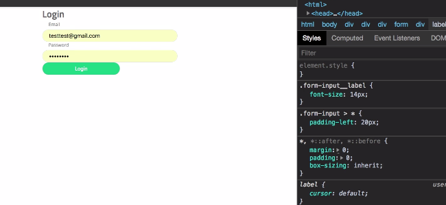
Now, let's get that tab in. Do you see that we have that tab over a bit. Let's see how much it is over from the side. It looks like we can't tell entirely. We could calculate it off all these numbers but that's pointless and a lot of hassle. Let's just say that the label and the input or & > *:
form-fields.scss
.form-input {
    display: grid;
    grid-gap: 6.5px;

    & > * {
        padding-left: 20px;
    }

    &__label {
        font-size: 14px;
    }
    &__input {
        box-sizing: border-box;
        height: 39px;
        width: 426px;
        border: 1px solid #E6E6E6;
        border-radius: 20px;
        color: #333333;
        font-size: 18px;
    }
}
That looks good. It puts it over about how much it is curved. What we need to do now is fix everything on the grid here. We need to apply this grid and a few other things.
Before we do that, let's just add in this border real quick. We don't want to apply it to .form-button because this is going to be used in other places. That might not have that line. So we need to add that straight into our form signinForm.js. We need to go to the button here and say:
signinForm.js
component={FormInput}/>
<div className='sign-in-form__line'></div>
<Field className='sign-in-form__login'
onClick={() => console.log('tryna submit')}
We won't put anything in because it's just a line, but then what we can do is we can go to signin.scss and say:
signin.scss
.sign-in-form {
    &__line {
        border-top: 1px solid #ccc;
    }
}
Now, let's head over to the application and see what we got. You'll see we have this line and it's extending all the way over. It just wasn't shrinking as much as I thought it was. That looks good. You'll notice it works with our grid-columns. It stretches out. That looks nice, but then our inputs don't, which is what we want.

Let's just check our design one more time. Let's see if there's anything else we need aside from these quick links. It like we have everything but the quick links, so we need to add in the quick links. Then we need to align everything where it belongs on the signinForm grid.
Let's go ahead and commit our code, and then let's take care of those in the next video. Let's say:
Terminal
git status
git add .
git commit -m "styled formfields components"
I'll see you in the next video.